
Walk through any home design showroom or scroll through renovation content right now and one thing becomes immediately clear: the era of flat, cool gray walls is over. In its place, something warmer, richer, and far more interesting has taken hold. Modern homes in 2026 are moving toward warmer, nature-inspired tones combined with bold, confident accents – colors that feel timeless yet fresh, stylish yet practical. It’s a genuine shift in how people think about their walls, and it’s showing up in living rooms, kitchens, and exteriors from coast to coast.
Overall, 2026 paint color trends prioritize warmth, comfort, and resale longevity over high-contrast modern minimalism. Major paint brands have responded in kind, with their color-of-the-year selections clustering around earthy neutrals, muted greens, and sophisticated deep tones. Whether you’re refreshing a single room or planning a whole-home repaint, understanding what’s actually resonating with homeowners right now makes the decision a lot easier – and a lot more rewarding.
Warm Greige: The New Neutral Standard
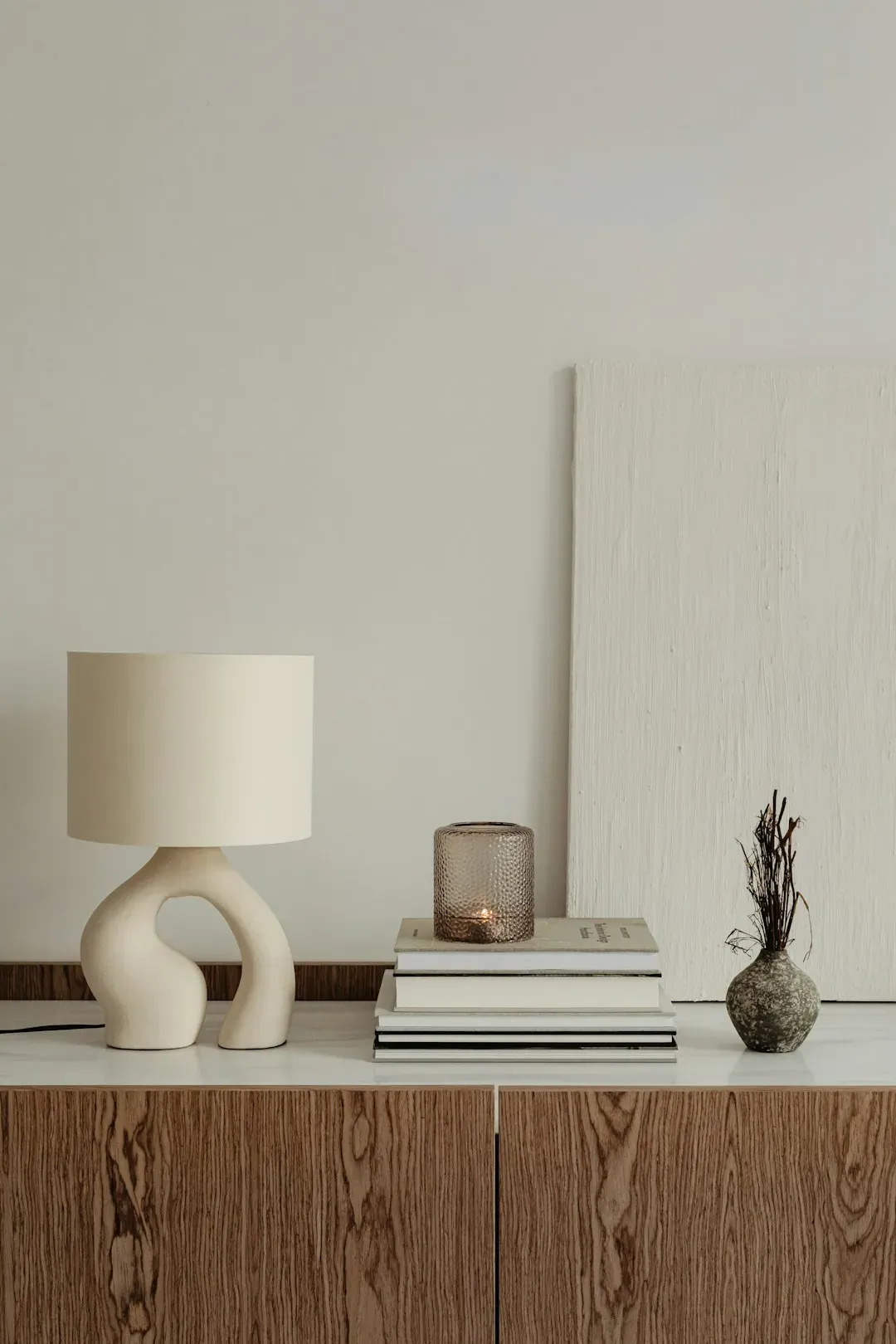
Greige, a blend of gray and beige, continues to dominate modern interiors. Unlike cold gray walls, warm greige adds comfort without losing a clean, contemporary look. It functions as a near-perfect backdrop, never demanding attention but always elevating whatever surrounds it. Furniture, art, and natural wood tones simply look better against it.
Warmer “greige” tones are becoming more common, with builders shifting toward grays with brown, taupe, or mushroom undertones to create a softer and more welcoming feel. In most new construction homes, gray is no longer the default choice – it is being replaced by warmer neutrals that photograph better, feel less sterile, and appeal to a broader range of buyers. For anyone thinking about resale value alongside aesthetics, warm greige is one of the safest, smartest choices you can make right now.
Soft and Warm Whites: The Off-White Evolution
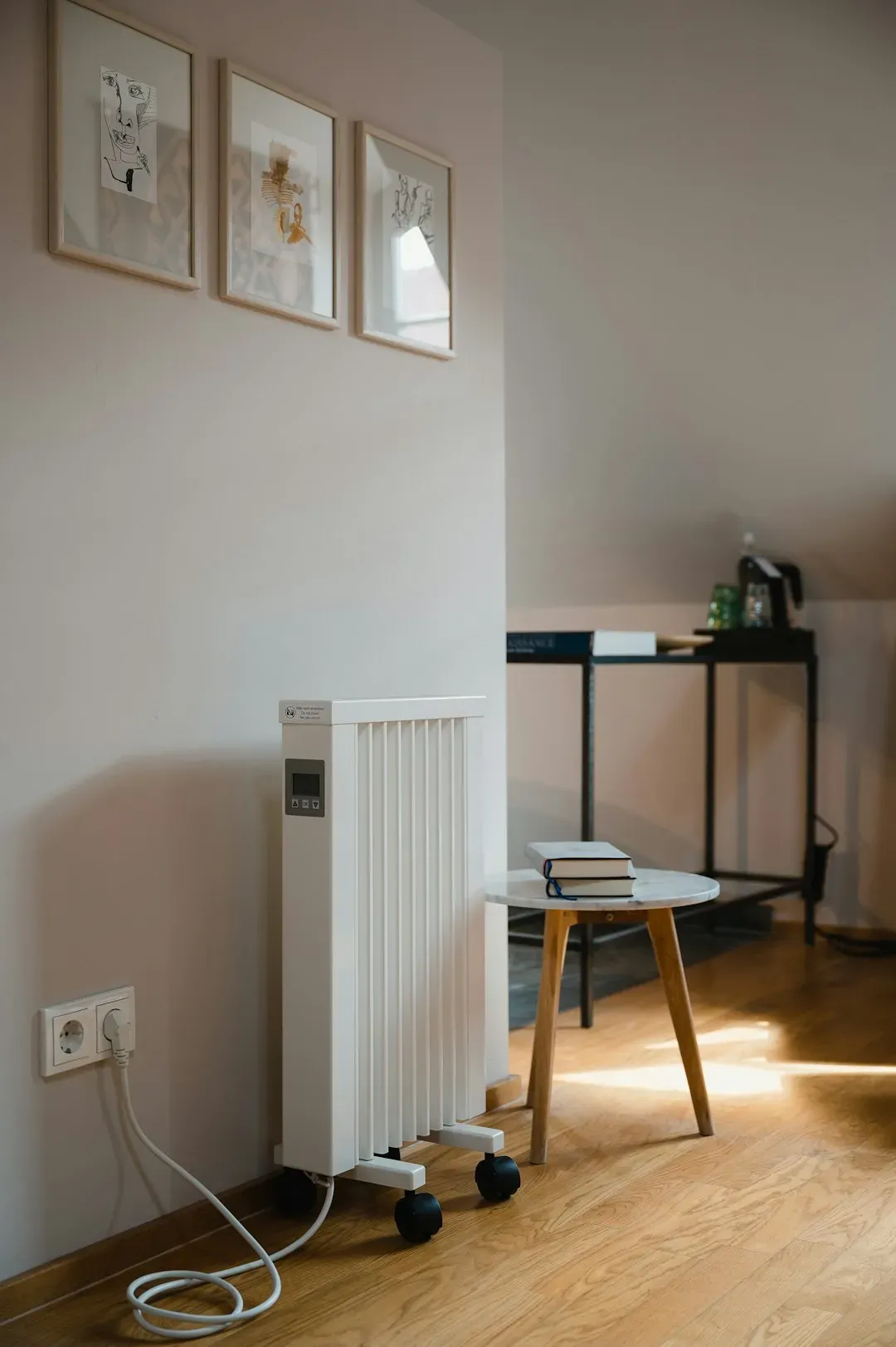
Soft, warm white paint colors are strong in 2025 and will continue to be in 2026, too. The difference between these and the cool, stark whites that dominated interiors a decade ago is significant. Warm, soft white paint colors offer a softer, more organic look, with lower brightness and clarity. Names like Benjamin Moore White Dove, Sherwin-Williams Alabaster, and Benjamin Moore Cloud White have become genuine classics in this category.
Benjamin Moore Pale Oak is one of the top-selling sample colors and among Benjamin Moore’s most popular overall, while Sherwin-Williams Aesthetic White serves as a reliable warm off-white that works well as an all-surface color – walls, trims, and doors alike. These colors are also big on exteriors, taking over from the previous white, Modern Farmhouse trend. If pure white feels too stark but you aren’t ready to fully commit to color, a warm off-white is the right move.
Earthy Greens: Sage, Olive, and Beyond
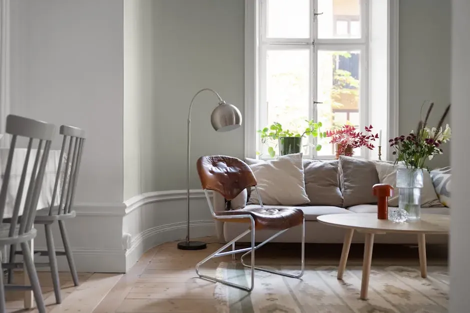
Green remains one of the strongest interior paint color trends for 2026. Soft sage and deeper olive tones bring a natural, calming atmosphere into modern homes. This isn’t a fleeting moment – green has been building momentum for several years, and it shows no signs of retreating. Muted sage greens, in particular, are more popular than darker, traditional greens.
Valspar chose “Warm Eucalyptus” as its 2026 color of the year – a green hue that, according to the company, reflects “a collective desire for calm, grounding design” that adapts to the ever-changing pace of life. Sherwin-Williams’ Dried Thyme is another standout: a beautiful mid-toned green with an earthy, organic vibe that feels grounded, calm, and pulled together – fresh without being flashy, and peaceful without feeling too muted. Green is, without question, one of the most versatile and enduring color families in modern interiors.
Universal Khaki and Earthy Neutrals: The Sherwin-Williams Direction
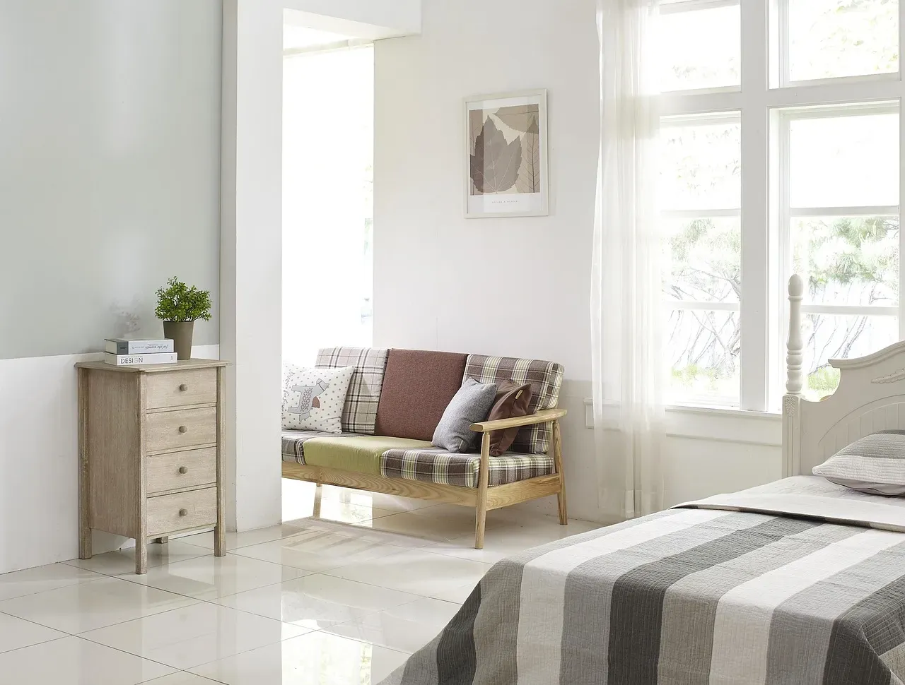
Sherwin-Williams declared Universal Khaki their 2026 Color of the Year. This “warm, earthy neutral” spearheads a trend forecast they’ve dubbed “Tailored and Timeless,” which uses descriptors like classic, simple, and elegant. It’s the kind of color that doesn’t shout but absolutely holds a room together – warm enough to feel inviting, neutral enough to work with almost anything.
As Sue Wadden, Sherwin-Williams’ director of color marketing, put it: “Khaki is more than just a neutral – it’s a timeless, go-anywhere shade that brings a sense of grounded elegance to any space.” Their trend forecasting commentary suggests the “Foundational Neutrals” palette is about creating a stable base – clean whites, light taupes, silvery grays, khaki – while allowing richer tones and deeper contrasts as accents. In other words, it’s not about bright “show-off” colors so much as well-considered backgrounds that let other design elements shine.
Silhouette and Deep Moody Tones: The Sophisticated Dark Side
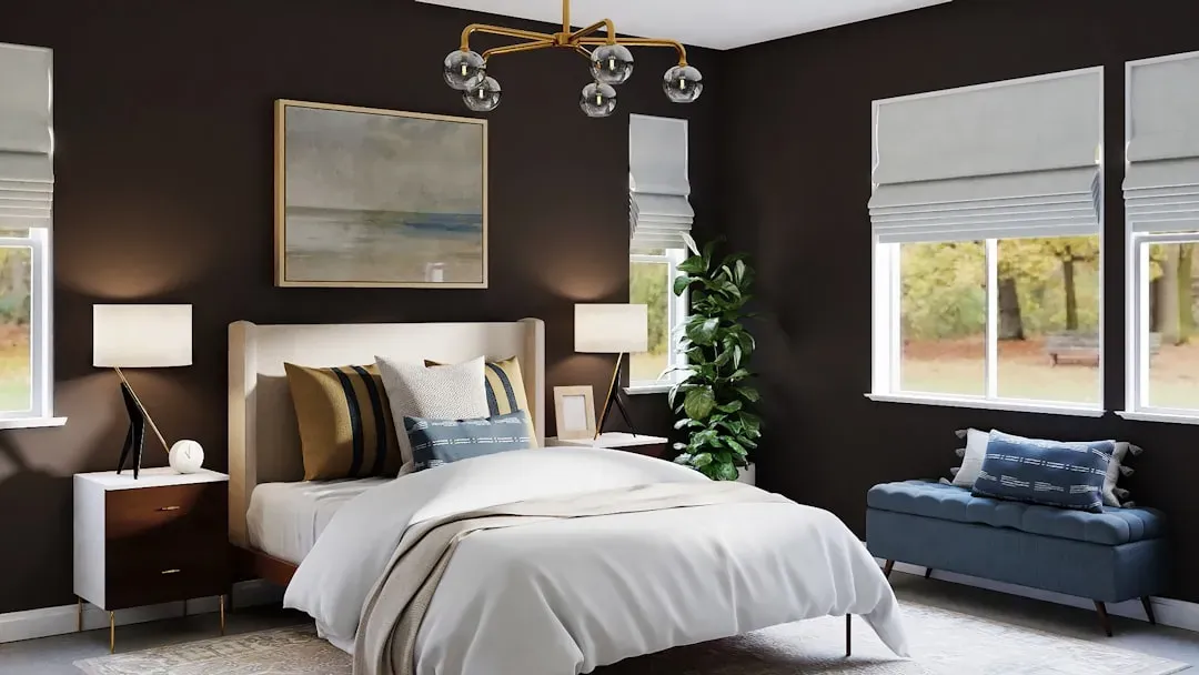
Benjamin Moore’s 2026 color of the year is “Silhouette,” a mix of “rich espresso hues with subtle notes of charcoal.” It’s a bold choice in the best sense – not a color that overwhelms, but one that brings a quiet, refined depth to a room. Silhouette signals a move away from ultra-bright or overtly bold colors toward something richer, deeper, and more introspective.
Benjamin Moore’s Color of the Year and Trends palette reflect evolving color psychology, consumer tastes, and design movements. The warmth and depth of Silhouette, with its emphasis on layered harmony, responds to the growing desire for spaces that feel grounded yet sophisticated. In practical terms, dark cabinetry in Silhouette against lighter countertops and backsplashes lends timeless drama to kitchens and bathrooms. Deep, moody tones are no longer reserved for accent walls – they’re anchoring entire rooms.
Terracotta and Clay Tones: Warmth with Character
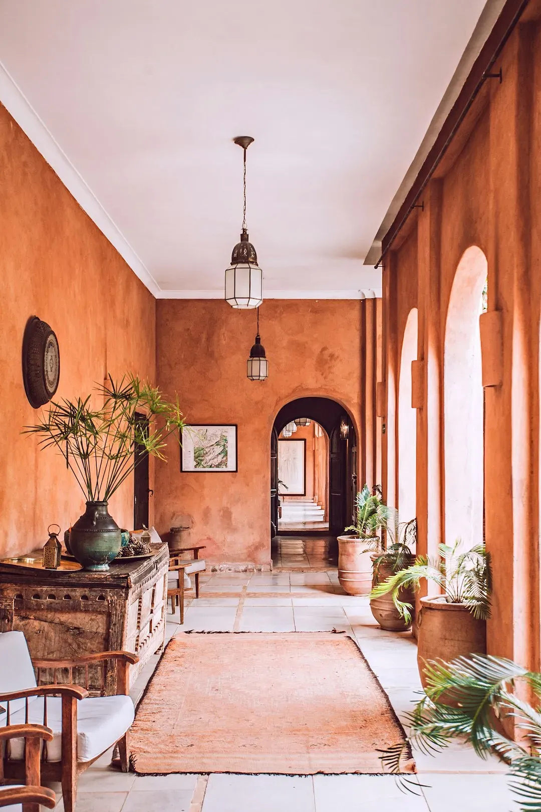
Faded terracotta is already defining 2026’s trends, falling somewhere between plaster pink and orange – an earthy, quiet neutral that serves as a warmer alternative to once-popular neutrals like gray or beige. Warm clay tones and muted terracotta shades are rising in popularity this year, driven by a broader cultural appetite for colors that feel connected to the natural world.
Earthy greens and terracotta tones allow people to add personality without making their homes feel trendy or overwhelming. When balanced with warm neutrals and natural materials, the result is a space that feels grounded, modern, and incredibly inviting. In bathrooms specifically, earth-inspired tones such as terracotta and sandstone are replacing bright whites, while powder rooms are leaning into deep slate blues and charcoals. Terracotta works brilliantly on accent walls, fireplace surrounds, and in dining rooms where warmth is the goal.
Smoky Blues and Blue-Gray Blends: Calm with Depth
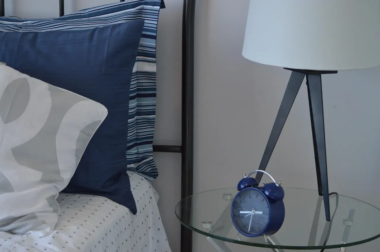
Deeper blues are moving into focus in 2026. Sophisticated blues, like smoky jades and navy-leaning hues, are rising in popularity for their ability to anchor a space while maintaining harmony and offering far more visual interest than stark whites and cool grays. Blue-gray blends are particularly well-suited to bedrooms, home offices, and bathrooms, where a calm, settled atmosphere matters most.
Through data gathered across customer consultations and completed projects, Lime Painting found that homeowners favor restorative depth in their bedrooms. Instead of pale pastels, homeowners are choosing saturated yet calming tones such as dusty plum, sage, and deep navy. Full-room saturation, often in matte or textured finishes, creates a boutique hotel feel in any bedroom environment. Blue remains one of the most enduring and beloved color families for a reason – it simply makes people feel good.
Hidden Gem and Jewel Tones: BEHR’s Smoky Jade Moment
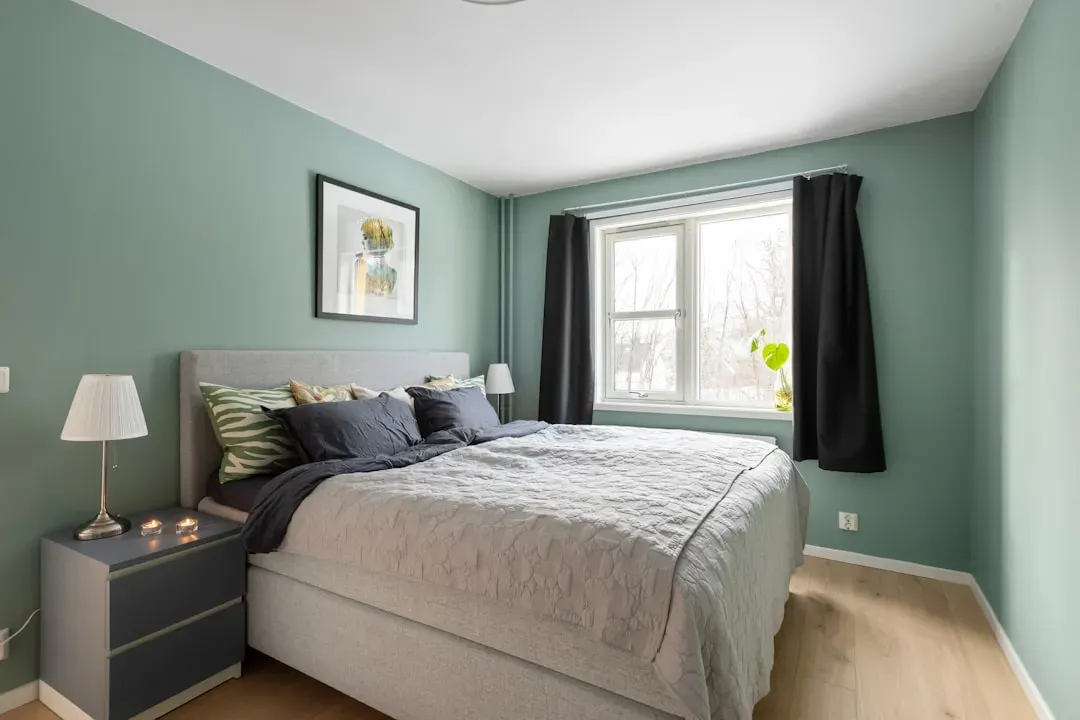
BEHR’s “Hidden Gem” is the brand’s 2026 Color of the Year, and it isn’t fading anytime soon. Described by the brand as a “smoky jade with an air of mystery and sophistication,” it’s the perfect cool-toned shade of earthy green that packs a serious punch when used for color drenching – or can serve as a grounding accent color in a neutral-heavy space.
Neutrals continue to dominate best-seller lists, yet sumptuous jewel tones made an equally compelling appearance, suggesting that 2026 color trends will celebrate not only grounding classics but also colors imbued with depth and emotion. Deep, enveloping shades that were historically used as accents are poised to step into the spotlight, redefining the concept of “neutral” for homeowners looking to create a lasting statement. Color drenching – painting walls, ceiling, and trim in the same tone – has become one of the most talked-about techniques for making these rich shades work in a whole room without feeling chaotic.
Color Drenching and the New Way Rooms Are Being Painted
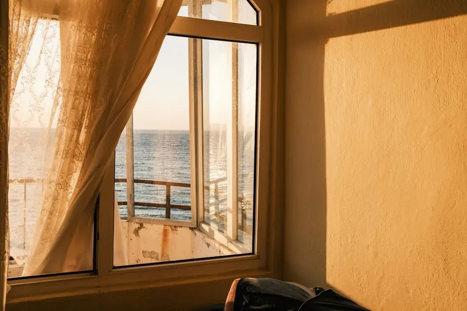
In kitchens and living areas, warm neutrals with subtle depth are replacing flat gray palettes. Color-drenched rooms – where walls and ceilings share the same tone – are gaining traction, and accent walls in desaturated blues or earthy greens are being used strategically throughout the home. It’s a technique that was once considered daring but has quietly become mainstream, partly because it’s so forgiving with the right color choice.
Instead of plain white ceilings, homeowners are using soft sage, dusty blue, or warm beige for a subtle impact. A single deep green or navy wall can anchor a room without overwhelming it. Designers consistently advise testing a color in your own space – painting large swatches and observing them at different times of day – and thinking carefully about existing flooring, cabinetry, trims, and fabrics. The new color should complement, not clash. That principle holds true regardless of which color family you’re drawn to.
Conclusion
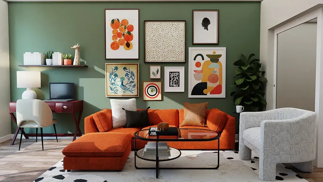
The through line connecting all of these popular paint colors is a collective move toward warmth, authenticity, and a genuine connection to the natural world. Earthy and nature-inspired tones are dominating – muted greens, terracotta-adjacent taupes, deep charcoals, and dusty blues. The overall vibe is cozy and intentional: colors that feel warm and livable rather than stark or trendy-for-a-minute. That’s a meaningful distinction. The most enduring paint choices are never just about what’s fashionable; they’re about how a color makes a home feel to the people living in it every day.
Whether you gravitate toward the quiet elegance of a warm greige, the grounded richness of a deep espresso tone, or the biophilic calm of a sage green, the options available right now are genuinely excellent. Paint is still one of the most affordable and transformative things you can do to a home. The only real rule is to test before you commit – light changes everything, and a color that looks perfect on a chip can tell a very different story at 7 in the morning.