
Walk into a home that just feels right, and you’ll notice it’s rarely about expensive furniture or a designer’s business card. It’s usually a handful of small, deliberate choices ing together. Lighting that flatters instead of flattens. Colors that talk to each other instead of competing. Furniture placed with intention rather than shoved against walls out of habit.
The good news is that these choices don’t require a huge budget or a background in interior design. They require attention to a few principles that professionals rely on again and again, because they simply hold up over time and across styles. Here’s a closer look at the ones worth knowing.
Layer Your Lighting Instead of Relying on One Source
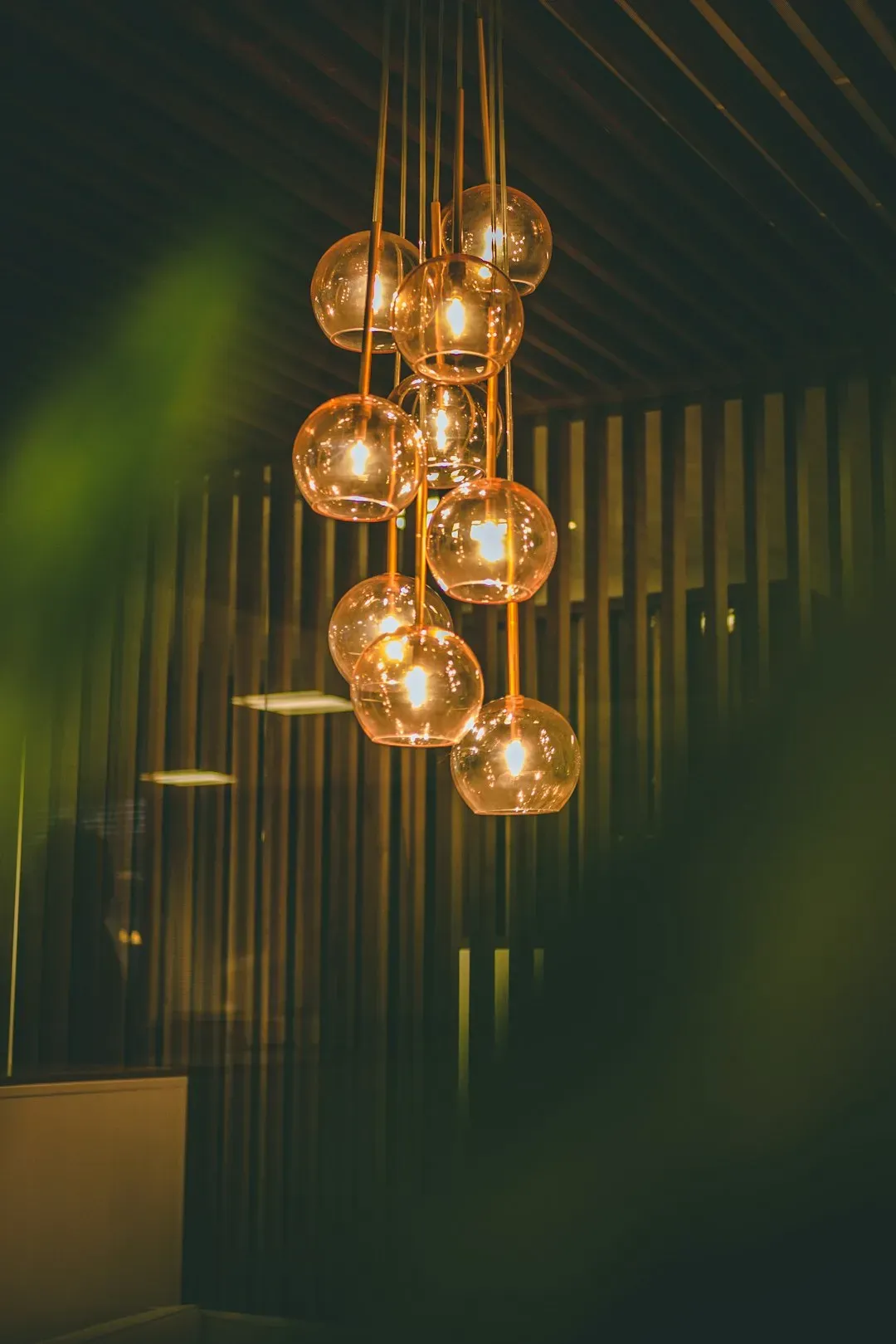
A single overhead fixture tends to flatten a room, casting flat, even light that makes everything look a bit clinical. Designers typically build rooms around three types of lighting: ambient (general room light), task (reading lamps, under-cabinet lights), and accent (spotlighting art or architectural features). When these layers together, a room gains depth and warmth that a single ceiling light simply cannot produce.
Dimmer switches make an outsized difference for very little money, letting the same room shift from bright and functional during the day to soft and relaxed in the evening. Floor lamps and table lamps placed at varying heights also help break up a room visually, since the eye reads staggered light sources as more interesting than one flat wash of brightness. Even two or three lamps at different heights in a living room can transform how the space feels after dark.
Anchor Every Room With a Focal Point
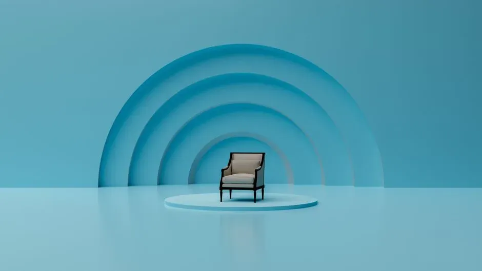
Rooms without a clear focal point tend to feel unsettled, as if the eye doesn’t know where to land first. A fireplace, a striking piece of art, a bold piece of furniture, or even a well-dressed window can serve this purpose. Once that anchor is established, the rest of the furniture and decor should support it rather than compete with it.
This doesn’t mean every room needs a dramatic gesture. In a bedroom, the headboard and bed itself often function as the natural focal point, so the arrangement of nightstands, lighting, and art should reinforce that rather than pull attention elsewhere. The goal is simply giving the eye one clear place to start before it takes in the rest of the room.
Follow the 60-30-10 Color Rule
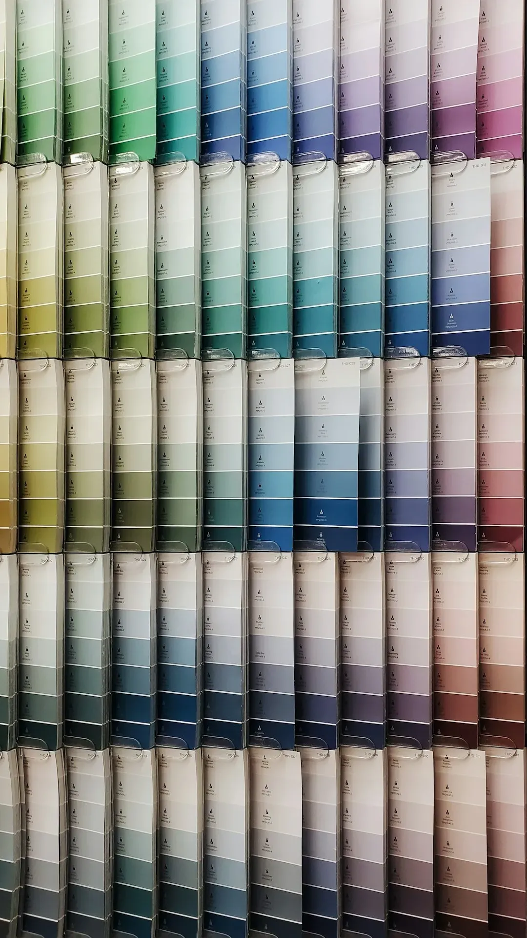
This long-standing guideline suggests dedicating about 60 percent of a room to a dominant color, roughly 30 percent to a secondary color, and the remaining 10 percent to an accent color. Walls and large furniture typically carry the dominant shade, upholstery or rugs carry the secondary tone, and small decor items like pillows, vases, or art deliver the accent pop. It’s a simple ratio, but it keeps color schemes from feeling either monotonous or chaotic.
The rule s because it mimics how the eye naturally processes a space, moving from large surfaces to smaller details. Bold accent colors can be swapped out seasonally or as trends shift, which keeps a room feeling current without requiring a full repaint. This is part of why the formula remains popular with both professional designers and confident do it yourself decorators.
Hang Art and Mirrors at Eye Level

One of the most common decorating mistakes is hanging art too high, a habit that can make ceilings feel lower and walls feel awkward. The general standard used by galleries and designers alike places the center of a piece around 57 to 60 inches from the floor, which corresponds to average eye level. Adjustments are reasonable above furniture, where the art should typically sit six to eight inches above the piece it’s paired with.
Mirrors follow a similar logic, though they carry an added function: reflecting light and views to make a space feel larger. Positioning a mirror across from a window can noticeably brighten a room by bouncing natural light deeper into the space. Grouping multiple mirrors or frames should still respect that eye level anchor, even when the arrangement includes several pieces of varying sizes.
Choose a Rug That Actually Fits the Room
![Choose a Rug That Actually Fits the Room (Rachel Swallows [CRS], Flickr, CC BY 2.0)](https://nvmwebsites-budwg5g9avh3epea.z03.azurefd.net/athomehustle/7c0ea4f536872df80a4cc25e7087ce7f.webp)
Undersized rugs are one of the most frequent layout errors in living rooms, often leaving furniture floating awkwardly at the edges. A well-proportioned rug should be large enough that at least the front legs of major furniture pieces rest on it, visually tying the seating area together. In dining rooms, the rug needs to extend far enough that chairs stay on it even when pulled out, which usually means adding two to three feet beyond the table’s edges.
Rug placement also affects how large a room feels overall. A rug that’s too small breaks the floor into fragmented sections, while a properly sized one creates a unified visual base for everything else. This is one of those details that’s easy to overlook but instantly noticeable once corrected.
Bring in Texture, Not Just Color

A room built entirely around color choices but lacking texture can feel oddly flat, even if the palette itself is well chosen. Mixing materials like wood, linen, wool, ceramic, and metal adds tactile variety that photographs and paint swatches simply can’t convey. Layering a chunky knit throw over a smooth leather sofa, for instance, creates contrast that makes both materials more noticeable.
Texture also plays a practical role in neutral color schemes, which have remained popular through the mid-2020s. When a room leans heavily on whites, beiges, or grays, texture becomes the primary tool for keeping things visually interesting. Woven baskets, nubby throw pillows, and matte versus glossy finishes all contribute to a space that reads as intentional rather than sparse.
Use Odd Numbers When Grouping Objects

Designers frequently arrange decorative objects, whether books, candles, or vases, in groups of three or five rather than even numbers. Odd-numbered groupings tend to look more natural and less rigid, largely because the eye can’t split them into perfectly symmetrical pairs. This principle shows up constantly on coffee tables, bookshelves, and mantels.
Varying the height and scale within these groupings adds another layer of visual interest. A tall candle, a medium stack of books, and a small trinket dish, arranged together, create a more dynamic silhouette than three identical objects lined up in a row. It’s a small trick, but it consistently produces a more polished look with almost no extra cost.
Leave Room to Breathe

Overfilling a space is one of the fastest ways to make it feel smaller and more chaotic than it actually is. Professional stagers often talk about negative space, the intentional empty areas that let the eye rest between objects. A shelf doesn’t need to be filled edge to edge, and a wall doesn’t need art in every available inch.
This principle applies to furniture arrangement as well, particularly around walkways and doors. Leaving at least 30 inches of clearance for main pathways keeps a room functional and prevents the cramped feeling that comes from furniture placed too close together. Restraint, in this case, tends to read as confidence rather than a missed opportunity.
Bring the Outdoors In With Greenery
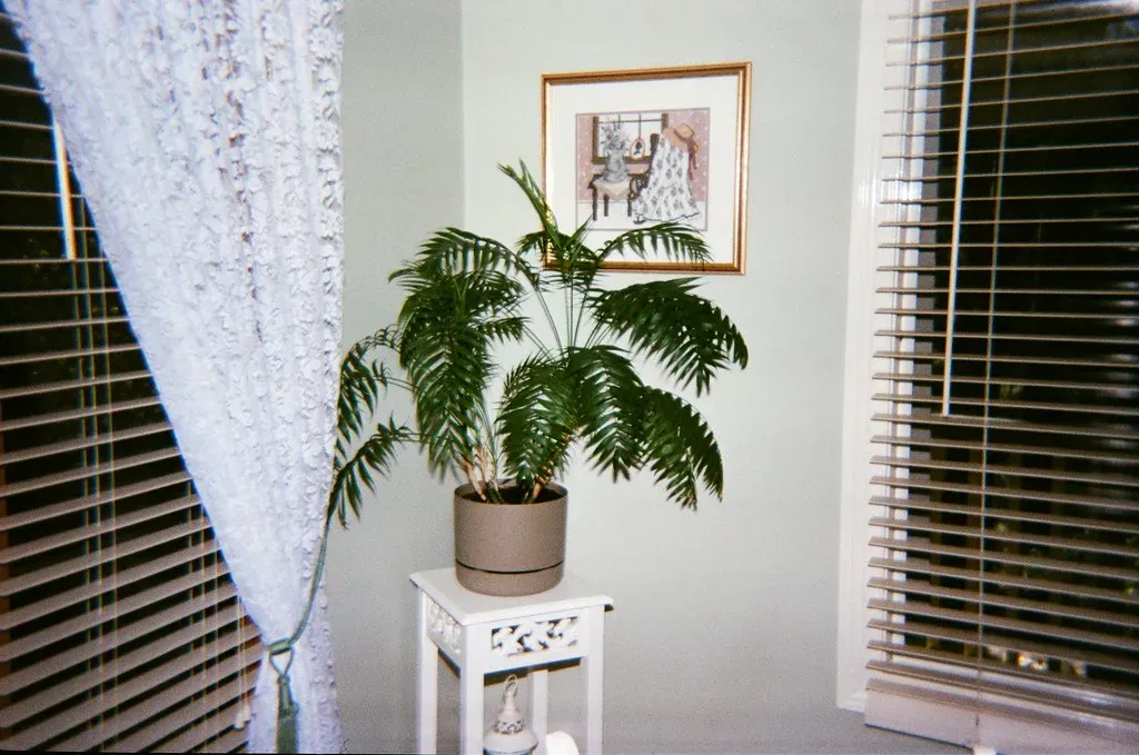
Houseplants remain one of the most affordable ways to add life and color to a room, and interest in them has stayed strong into 2026 as more people prioritize wellness-oriented home design. Beyond the visual benefit, certain plants can help soften hard architectural lines and add a layer of texture that furniture alone can’t provide. Even a single well-placed fiddle leaf fig or trailing pothos can change the character of a corner that would otherwise feel empty.
For those without much natural light or time for plant care, high-quality faux greenery has become a legitimate substitute, with modern versions far more convincing than the plastic plants of decades past. Grouping plants of varying heights, similar to the odd-number rule for decor objects, creates a more organic, layered look. This approach s in nearly any room, from a bright kitchen windowsill to a dim hallway corner.