
The charm of reclaimed materials

Homes built or renovated with salvaged wood, brick, and hardware tend to carry a warmth that new materials struggle to replicate. Reclaimed barn beams, old factory windows, and weathered doors bring texture and history into a space without requiring a single antique in the room. This approach has grown steadily since the mid 2010s, partly driven by sustainability concerns and partly by a simple aesthetic preference for imperfection over polish.
What makes these homes memorable is the contrast they create. A sleek modern kitchen paired with a century old ceiling beam feels more interesting than either element alone. The imperfections, the knots, the nail holes, the uneven grain, become the point rather than a flaw to hide.
Color as a personality statement
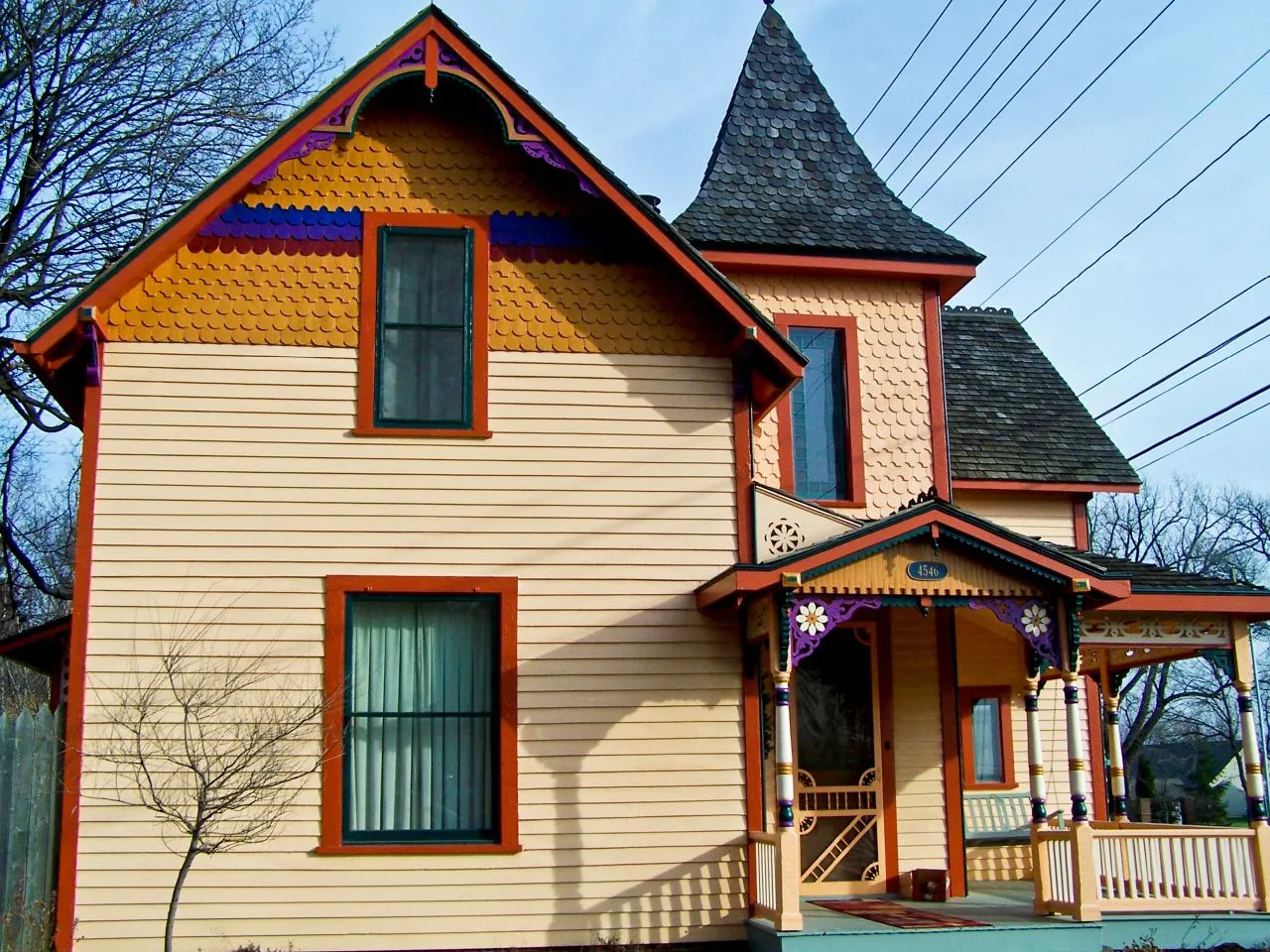
Bold paint choices remain one of the fastest ways a home signals its personality before you even step inside. Deep greens, ochre yellows, and moody blues have become common exterior choices in both cities and small towns, replacing the once dominant beige and gray palettes. Interior designers have noted this shift toward saturated color as homeowners move away from resale-focused neutrality and toward spaces that reflect their own taste.
Inside, color often shows up in unexpected places rather than covering entire walls. A single painted ceiling, a bright front door, or a lacquered built in bookshelf can carry the same visual weight as a full room makeover. These smaller, concentrated doses of color tend to age better and feel less overwhelming over time.
Architectural quirks worth keeping
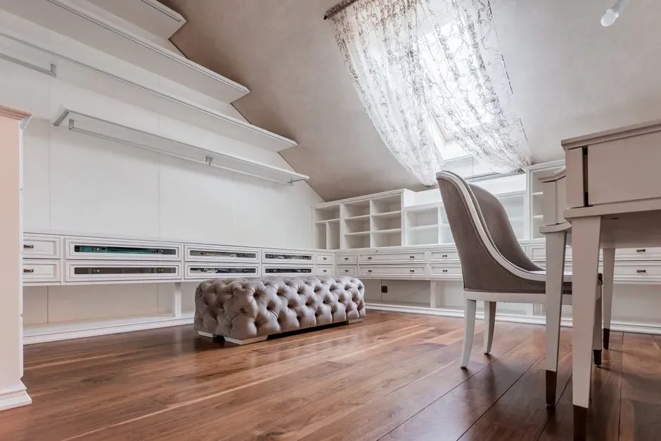
Sloped ceilings, oddly shaped nooks, and narrow staircases are often the first things a renovation plan tries to eliminate. Yet many of the most memorable homes keep these quirks intentionally, treating them as opportunities rather than problems. A low ceiling in an attic bedroom, for instance, can become a cozy reading corner instead of an inconvenience.
Preservation architects frequently point out that these irregularities are what give older homes their identity. Removing them in favor of open, uniform floor plans can technically increase resale value, but it also erases the very features that made the home distinctive in the first place. Many owners now choose to work around a quirk rather than flatten it out.
Mixing old furniture with new design
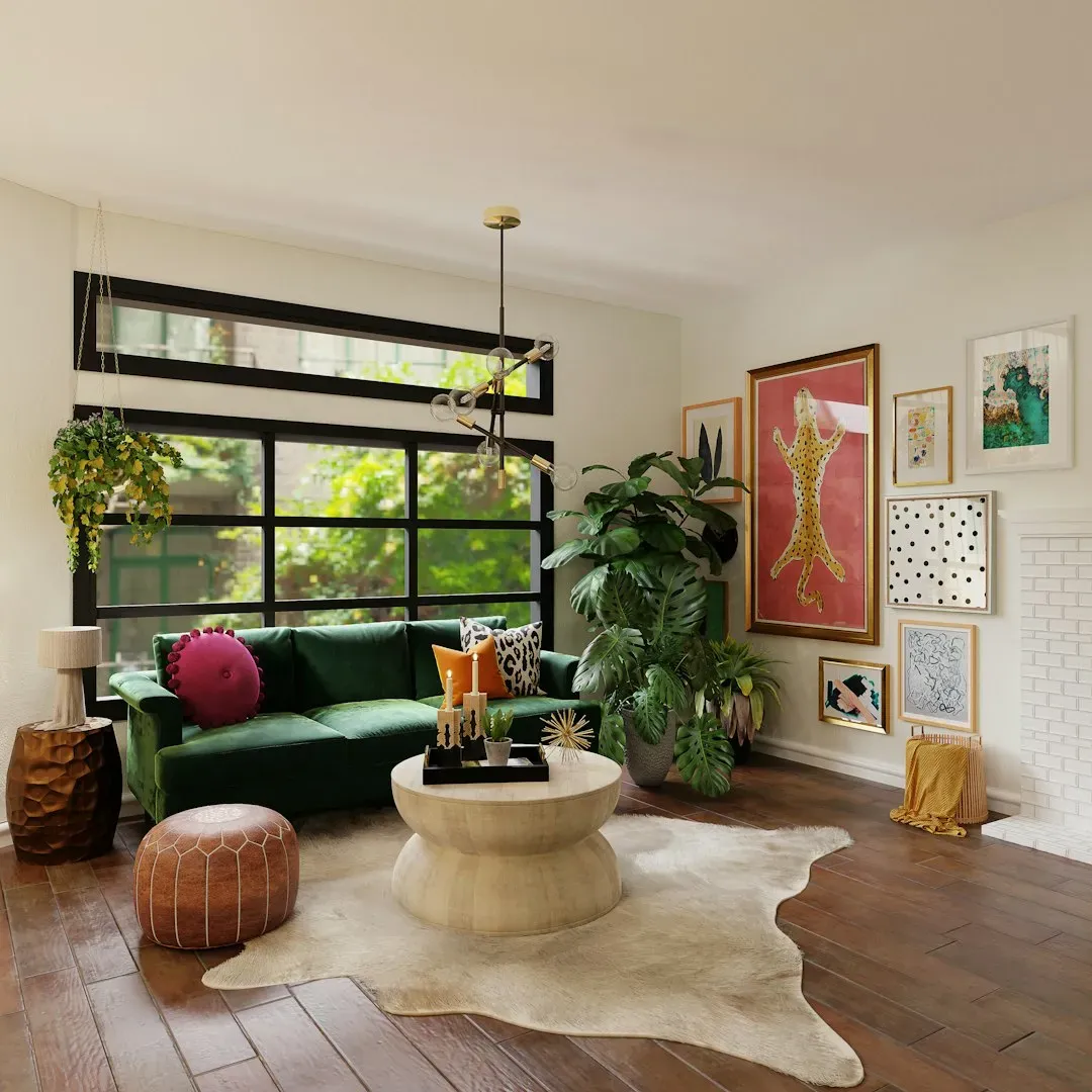
Full period rooms, where every piece matches a single era, have fallen out of favor compared to eclectic mixing. A mid century modern chair next to a Victorian side table, or a contemporary sofa under a chandelier salvaged from an estate sale, creates a layered look that feels collected rather than purchased all at once. This mixing approach has become one of the defining traits of interiors featured in shelter magazines and design blogs since around 2022.
The appeal lies in the sense of time passing within a single room. A home that looks like it was furnished in one afternoon rarely holds attention the way a home built up over years does. Each mismatched piece suggests a story, even if that story is simply a good find at a flea market.
Small spaces designed with intention
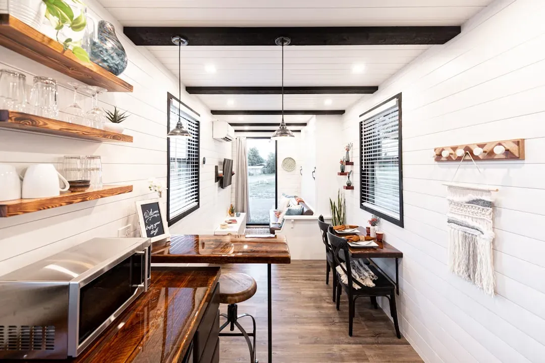
doesn’t require square footage. Tiny homes, cottages, and compact city apartments often show more personality per square foot than sprawling houses, precisely because every inch has to earn its place. A well designed 600 square foot cottage can feel richer than a generic 4,000 square foot new build with empty rooms and little detail.
Built in shelving, window seats, and multipurpose furniture are common solutions in these homes, but the best examples go further by treating constraints as design opportunities. A narrow hallway becomes a gallery wall. A low ceiling nook becomes a daybed. The result feels intentional rather than cramped.
Gardens and outdoor spaces as extensions of the home
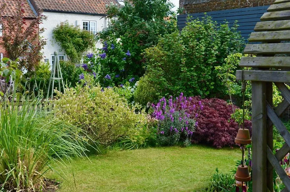
A home’s rarely stops at the front door. Overgrown, slightly wild gardens have become more appealing to many homeowners than manicured lawns, reflecting a broader interest in native plants and low maintenance landscaping. Cottage style gardens, with their loose borders and mix of flowering plants, mirror the same eclectic philosophy found inside these homes.
Outdoor rooms, covered porches, pergolas, and simple patios with mismatched chairs extend the personality of the interior outward. These spaces often become the most photographed part of a property, not because they are the most expensive to build, but because they feel the most human. A porch with a worn wooden swing tends to say more about a home than a freshly poured concrete patio ever could.
Handmade and artisan details
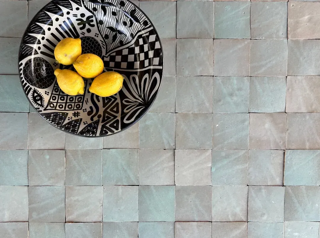
Tile work, pottery, and textiles made by hand carry a visible irregularity that mass produced versions lack. Handmade zellige tiles from Morocco, for example, have become a favored choice for kitchen backsplashes precisely because no two tiles are perfectly identical. That slight inconsistency in glaze and shape gives a wall more visual depth than a uniform ceramic tile ever could.
The same logic applies to woven rugs, hand thrown ceramics, and custom ironwork. These details cost more and take longer to source, but they introduce a texture of craftsmanship that feels increasingly rare in an era dominated by flat pack furniture. Homeowners who invest in even a few handmade pieces often find they anchor an entire room.
Layered lighting instead of a single fixture
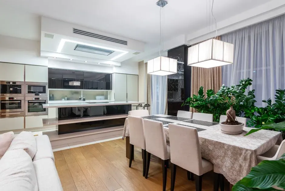
Overhead lighting alone tends to flatten a room, while layered lighting, combining ceiling fixtures, table lamps, sconces, and candles, builds atmosphere and depth. Design professionals commonly recommend at least three light sources per room to avoid the flat, showroom feel that a single overhead bulb creates. This layering approach has become standard advice in interior design guidance published throughout the past several years.
Vintage and statement lighting fixtures in particular contribute enormously to a room’s personality. A single unusual pendant light or an antique brass floor lamp can do more for a space’s than an entire wall of new furniture. Lighting, more than most design elements, tends to be the detail that visitors remember afterward.
Personal collections displayed with confidence
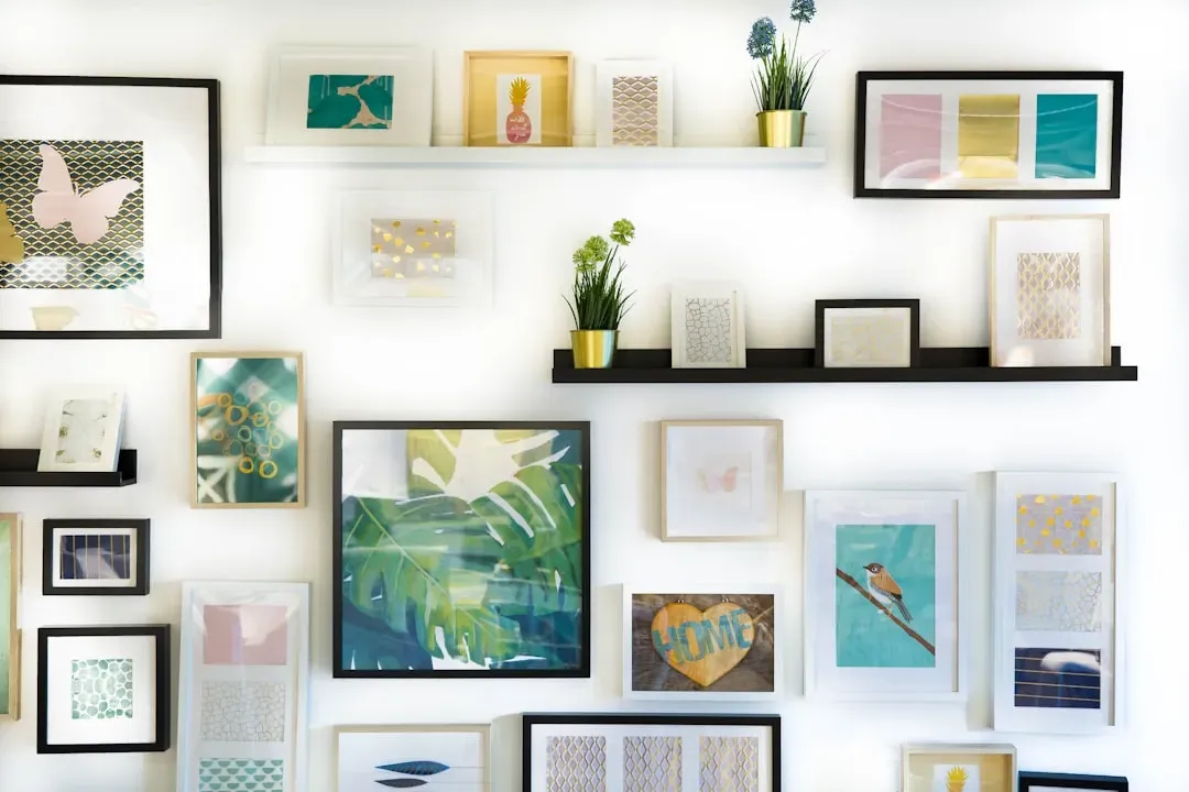
Books, artwork, travel souvenirs, and family heirlooms displayed openly, rather than tucked away, give a home an unmistakable sense of identity. A wall of framed photographs collected over decades or a shelf crowded with books in no particular order communicates more about the people living there than any curated showroom arrangement could. This kind of display has always existed, but it has gained renewed attention as homeowners push back against overly minimalist trends.
The confidence to display a full, sometimes cluttered collection is itself part of the . A single perfectly placed vase looks nice, but a shelf of forty mismatched vintage vases collected over a lifetime tells an actual story. Homes that embrace this kind of accumulated detail tend to feel warmer and more personal than those that edit everything down to a minimalist ideal.
Regional and vernacular building styles

Homes that reflect their local climate and building traditions, adobe structures in the American Southwest, shingle style cottages in New England, or stucco haciendas in parts of California, carry a built in sense of place that generic construction lacks. These vernacular styles developed over generations in response to local weather, available materials, and cultural history, which gives them an authenticity that is difficult to manufacture elsewhere. A thick adobe wall isn’t just decorative, it’s a practical response to desert heat that happens to also look beautiful.
Preserving or referencing these regional styles, rather than defaulting to a generic national aesthetic, keeps a home connected to its surroundings. Architects working in historic districts frequently emphasize maintaining original rooflines, window proportions, and material choices for exactly this reason. A home that looks like it belongs to its landscape almost always reads as more ful than one that could exist anywhere.