
There’s a reason some bedrooms make you exhale the moment you walk in, while others just feel like a place to crash. It’s rarely an accident. The best sleep spaces are built from a handful of deliberate choices, some obvious and some easy to overlook, that work together to slow your nervous system down.
From color and lighting to texture and layout, small decisions add up to a room that actually helps you unwind rather than just holding your mattress. Here’s a look at the ideas designers and sleep researchers keep coming back to when they talk about bedrooms built for real rest.
Cool, muted blues that quiet the mind
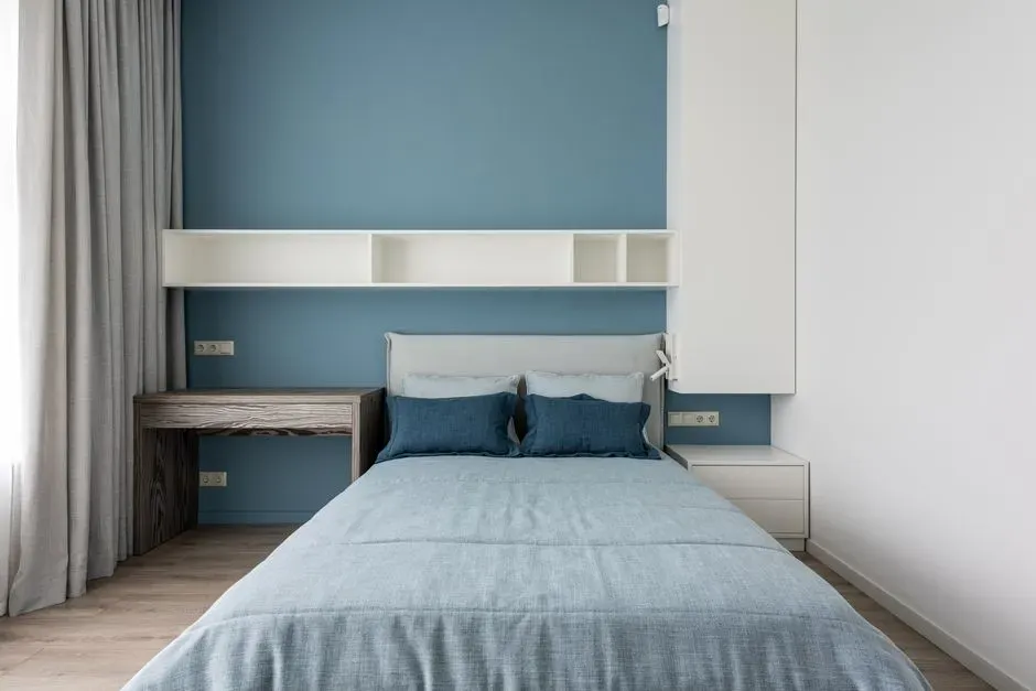
Blue keeps showing up at the top of relaxing color lists, and there’s more behind that than aesthetics. The best bedroom colors for sleep are those that can promote rest and relaxation, such as blue, green, and soft shades of purple, white, or off white, with blue often described as peaceful, tranquil, secure, and orderly. One widely cited UK hotel study found a striking gap in actual sleep time tied to bedroom color choice.
People sleeping in blue bedrooms averaged 7 hours and 52 minutes of sleep per night, compared to just 5 hours and 56 minutes for those in purple bedrooms. For 2026, designers are steering away from flat pastel blue toward something with more depth. Designers are looking for blues that have a cooler tone and a more natural feel, often achieved by mixing in a bit of green, since smoky blue brings a sophisticated and timeless palette of depth and moodiness to a darker bedroom.
Warm, grounding neutrals instead of cold gray
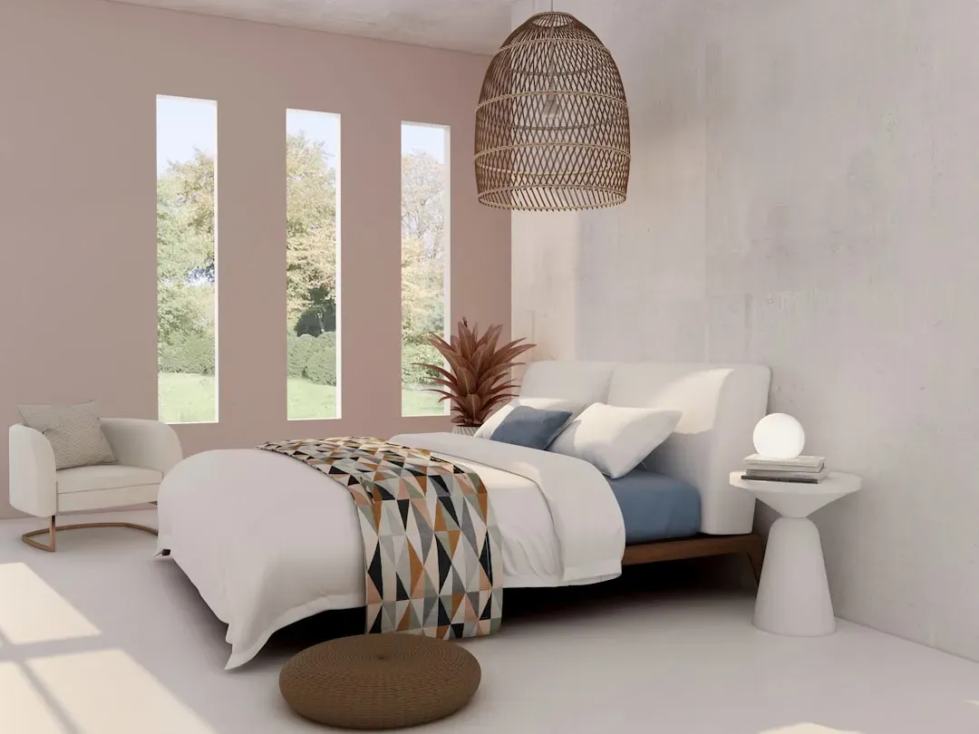
The gray-and-white bedroom that dominated the last decade is fading fast, and not because gray is inherently bad for sleep. Cool-toned grays and beiges were once the go-to color choices for bedrooms, but designers now recognize that a tranquil sleep space doesn’t have to mean a boring one. The shift is toward tones that still read as calm but carry more warmth and personality.
Neutrals are still part of current bedroom color trends, but they are being reinvented as warmer, more saturated shades that envelop bedrooms rather than stripping them back. Think warm taupe, soft terracotta, or a muted olive rather than icy greige. Warm tones like burgundy, deep wine, beige, blush, tan, and cream typically create feelings of coziness, comfort, and optimism, which suits a bedroom well.
Deep, cocooning shades used with restraint
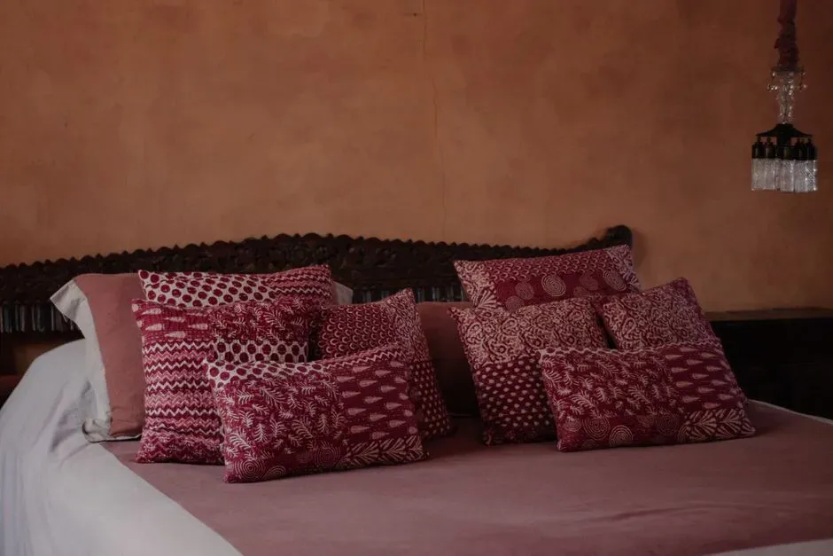
It sounds counterintuitive, but a darker wall color can actually make a bedroom feel more restful, not less. Burgundy has continued making its way into bedrooms, adding sophistication and moodiness, and decorating with this rich hue doesn’t need to mean painting every wall. A single accent wall or a headboard nook in a deep tone can create the enclosed, protected feeling that helps people mentally switch off at night.
Pairing a moody color with something cooler keeps the effect calming rather than heavy. Burgundy, especially when teamed with calming teal, adds drama in a refined way to bedrooms. The trick is using dark, saturated color as a frame around soft lighting and light-colored bedding, rather than letting the whole room feel dim and closed in.
Soft, low-key lighting that respects your body clock
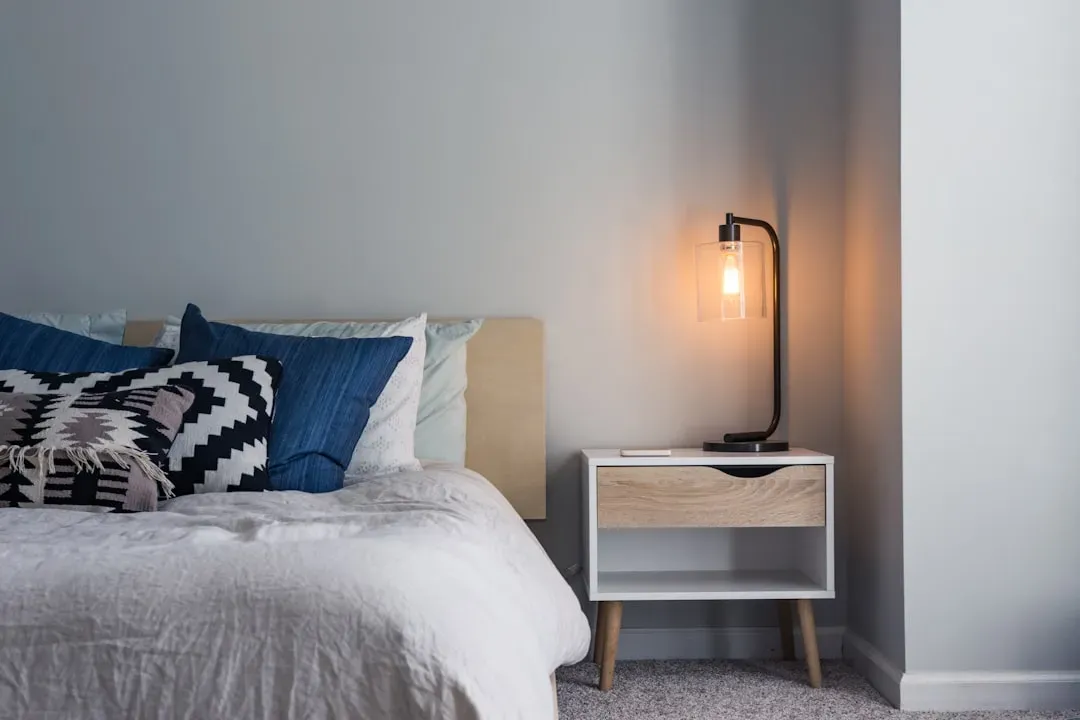
Lighting does more than set a mood in a bedroom; it actually talks to your body’s internal clock. Research on light temperature shows a measurable difference between harsh overhead lighting and something softer. A study comparing bedroom light environments found that traditional fluorescent lamps at a high correlated color temperature of 6000 K produced different sleep outcomes than a warmer, low color temperature LED light around 2000 K.
Warmer, dimmer light in the hour before bed signals to the brain that it’s time to slow down, while bright white or blue-tinted light does the opposite. A relaxing bedroom usually leans on a few small, warm-toned lamps rather than one bright overhead fixture. Dimmer switches, bedside lamps on a soft schedule, and even candle-style lighting all support that gradual wind-down rather than fighting against it.
A cool, well-regulated room temperature

No color scheme can fully compensate for a bedroom that’s too warm at night. Temperature turns out to be one of the most consistently proven factors in sleep quality, more so than almost any decorative choice. Research on nighttime ambient temperature found that sleep was most efficient and restful when the room ranged between roughly 20 and 25 degrees Celsius, with a clinically relevant drop in sleep efficiency once temperatures climbed from 25 to 30 degrees.
This matters more with each passing summer, since bedrooms in many older homes weren’t built with serious heat in mind. Bedrooms are often overlooked in the design of residential properties, even though the interior environment of a bedroom directly affects sleep quality, which in turn affects health and wellbeing. A beautiful bedroom is one that pairs its color palette with breathable bedding, good ventilation, and blackout curtains that also help hold a stable temperature.
Matte finishes over glossy surfaces
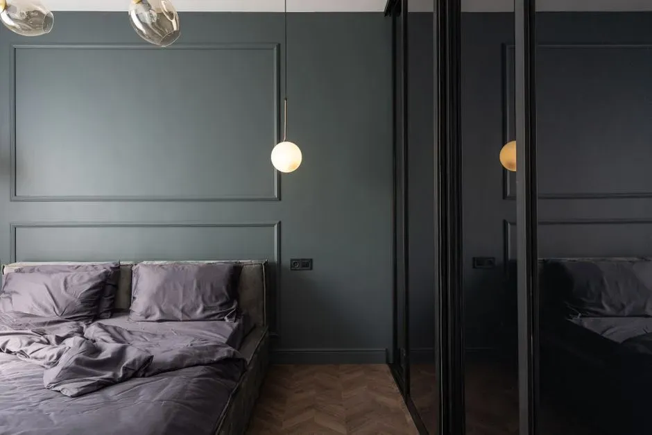
The finish of a paint or fabric matters almost as much as the color itself, and it’s a detail most people never think about. The finish of the paint is as important as the color when it comes to sleep quality, since flat or matte paint is preferable for a bedroom while glossy finishes can reflect too much light and stimulate the brain. That reflected light can be subtle during the day but noticeable once a lamp or hallway light hits the wall at night.
The same logic applies to furniture and decor. High-shine lacquered nightstands or glossy metal fixtures can bounce ambient light around the room in ways that keep the space feeling active rather than settled. Choosing matte or lightly textured surfaces for walls, headboards, and larger furniture pieces keeps the visual noise down once the lights are low.
Sculptural, softer furniture shapes
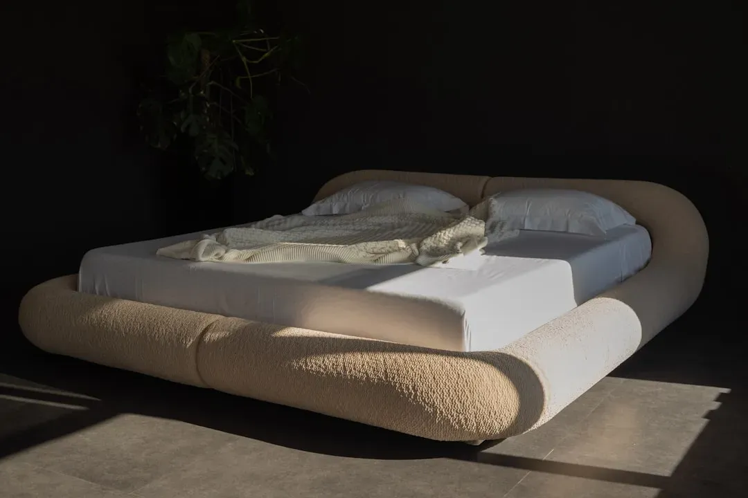
Bedroom furniture in 2026 is trading hard edges for curves, and it’s not purely a style statement. The shift toward curvier bed designs adds a touch of sophistication while promoting comfort, and as bedrooms continue to evolve into sanctuaries, sculptural bed frames contribute to a more personalized, restful feel. Rounded headboards and softly upholstered frames read as less imposing than angular, boxy ones, which can make a small or busy room feel calmer at a glance.
Material choice plays into this too. Pairing a sculptural bed frame with neutral, tactile bedding like linen or textured throws highlights the bed’s curves and helps create a balanced, calming atmosphere. Natural materials such as solid wood, rattan, and boucle upholstery add warmth without adding visual clutter, which is exactly the balance a relaxing bedroom needs.
One grounding rug instead of scattered pattern
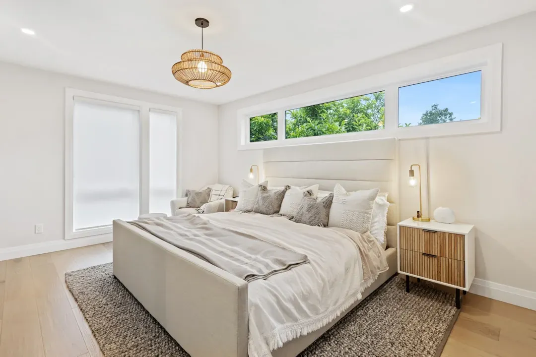
Flooring is easy to underestimate, but a good rug can anchor an entire room and set its emotional tone. One of the more eye-catching updates in current bedroom design is the statement rug, which works well anchoring a room when placed under the bed or in a reading nook. Rather than layering multiple patterned textiles, many calm bedrooms now build around a single strong rug and keep everything else simple.
The rug’s tone can actually do quiet psychological work. Beyond style, these rugs work as mood setters, since a bold, colorful design can inject energy into a minimalist room, while a muted motif can enhance a calm, neutral space. For a bedroom aimed squarely at relaxation, a softer, more muted rug paired with plain bedding tends to keep the room feeling settled rather than busy.
Color combinations that stay on the same wheel

There’s a simple design rule that quietly supports better sleep: keep your palette close together rather than contrasting. Color shades that are parallel on the color wheel encourage rest more than colors that contrast or are unrelated. That’s part of why a lot of the most restful bedrooms lean on tonal schemes, several shades of the same blue-green or the same warm terracotta family, instead of pairing opposite hues.
This doesn’t mean the room has to be flat or monochrome. Layering different textures and materials within one narrow color family, linen in cream, a wool throw in oatmeal, a wood frame in warm brown, keeps things visually interesting without introducing the kind of contrast that can feel stimulating right before bed. It’s a subtle rule, but it shows up again and again in bedrooms that photograph as calm and feel calm to actually sleep in.
Rooms built around wind-down rituals, not just decor
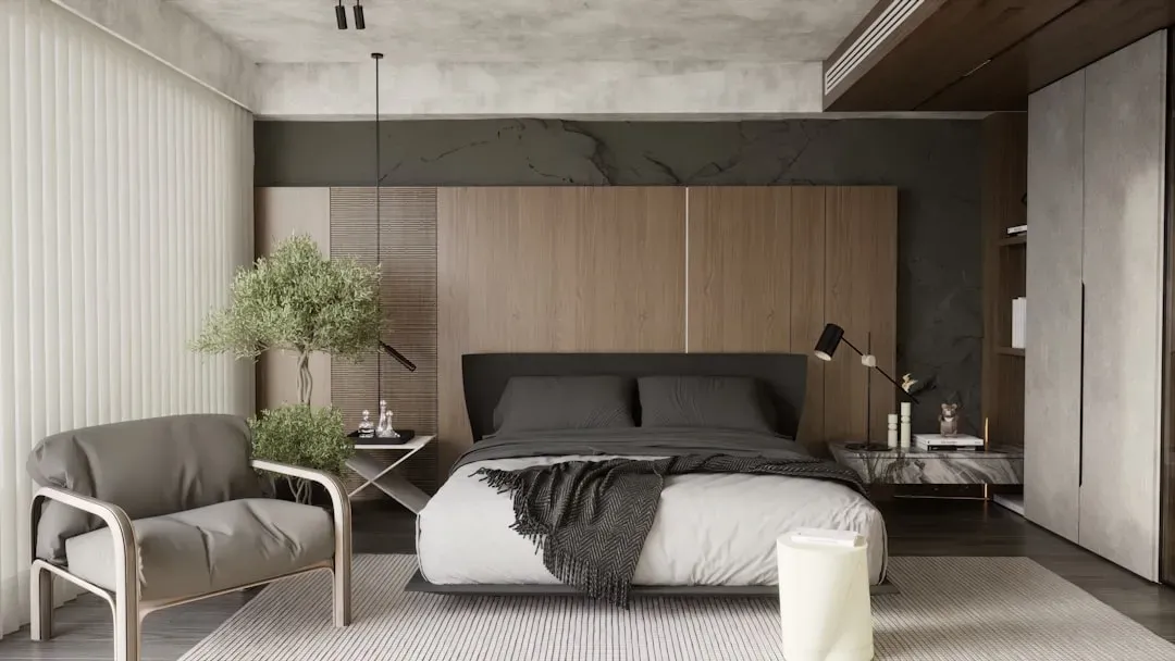
The most relaxing bedrooms tend to be designed around a routine, not just a look. A reading nook with a single comfortable chair, a small table for a book and a glass of water, or a dedicated spot for a wind-down stretch all signal to your brain that this room has a slower pace than the rest of the house. Designers are applying calming colors to highlight architectural details and create cozy reading corners, which reinforces the room’s purpose as a retreat rather than a multipurpose space.
Keeping screens, desks, and exercise equipment out of the bedroom, even in small apartments where space is tight, helps preserve that association between the room and rest. Since the interior environment of bedrooms directly affects sleep quality, and insufficient sleep has well-known negative consequences for health, treating the bedroom as a single-purpose space is one of the simplest structural choices a person can make. A beautiful bedroom, in the end, is one whose design constantly points back to a single job: helping you rest.
The takeaway

None of these choices work in isolation. Color sets a tone, but it needs the right lighting, temperature, and materials to actually deliver on that promise of rest. The bedrooms that succeed at feeling genuinely relaxing tend to combine several of these elements at once rather than relying on one bold color choice or one statement piece of furniture.
If there’s one thread running through the research and the design trends alike, it’s that restraint pays off. A calmer palette, softer light, a stable temperature, and a little less visual clutter go a long way toward turning a bedroom from a place you simply sleep into one that actually helps .