
Soft sage and muted greens
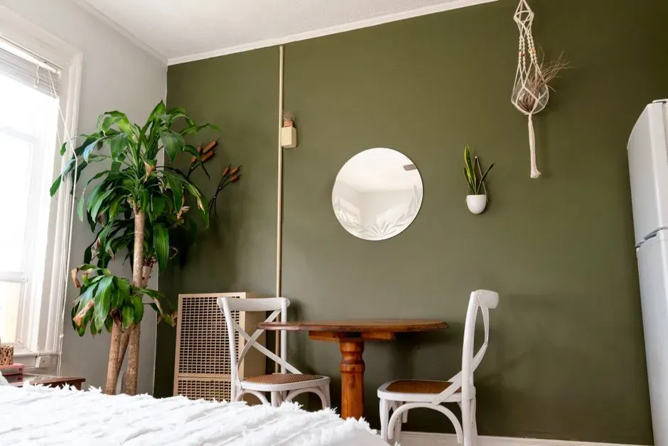
Green keeps showing up at the top of every calming color list, and it’s not just a design fad. Green continues to dominate home interiors because it represents growth, harmony, and wellness, and it is one of the most relaxing colors because it is strongly associated with nature. Paint brands have picked up on this too, with Valspar naming a green its 2026 Color of the Year and describing it as “naturally restorative and serene.”
Designers are also seeing green move in new directions. Earthy greens continue to lead the charge into 2026 because they create an immediate connection to nature, feeling restorative and relaxing in living rooms and bedrooms. A sage or moss tone paired with houseplants and natural wood tends to read as effortless rather than staged, which is part of why it works so well in spaces meant for unwinding.
Warm neutrals and greige
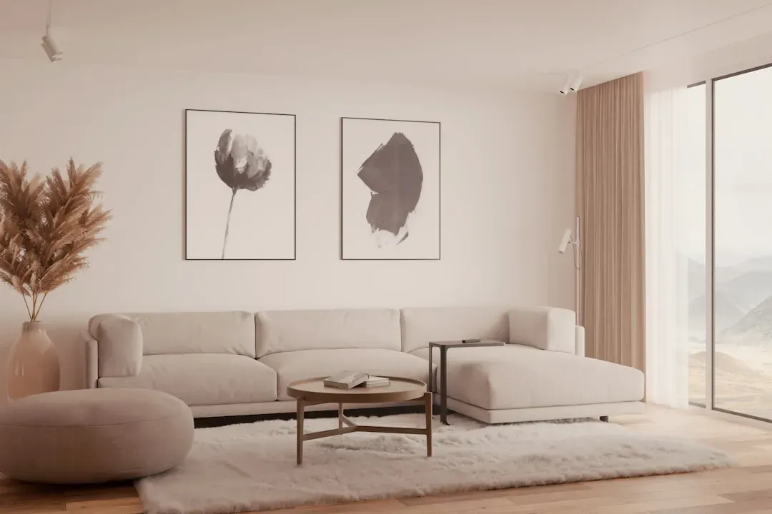
Cool gray had a long run, but it’s fading fast from calming color lists. Cool grey used to be the neutral of choice years ago, but that tide has turned, and warm neutrals now reign supreme. Designers describe the shift plainly, favoring “warmer neutrals, like a mushroom taupe, soft stone, or warm-toned beige” over anything with a cold undertone.
Greige, a warm gray with cream mixed in, has become something of a middle ground for people who like the flexibility of gray but not its chill. 2026 trends include greige, a warm creamy gray without cool stark tones, recommended for its calming, grounding qualities. It’s a color that fades into the background just enough to let furniture and lighting do the visual work.
Pale blues for bedrooms
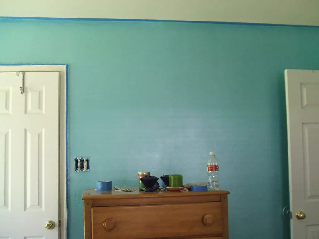
Blue has a long track record in sleep spaces, and 2026 hasn’t changed that. One designer notes that a secret to a serene paint choice is selecting a color that mimics natural light, and that a light aqua shade can enhance and calm a bedroom with few windows. That’s a useful trick for rooms that don’t get much sun, since the right blue can visually stand in for daylight.
Living rooms are picking up on the same idea. Delicate shades of blue add color to a living room while maintaining a relaxed, comfortable feel, with designers leaning heavily into soft blues that feel calm, airy, and rooted in nature. These shades tend to pair easily with warm wood and brass, so they rarely feel cold in practice.
Warm off whites and creamy tones
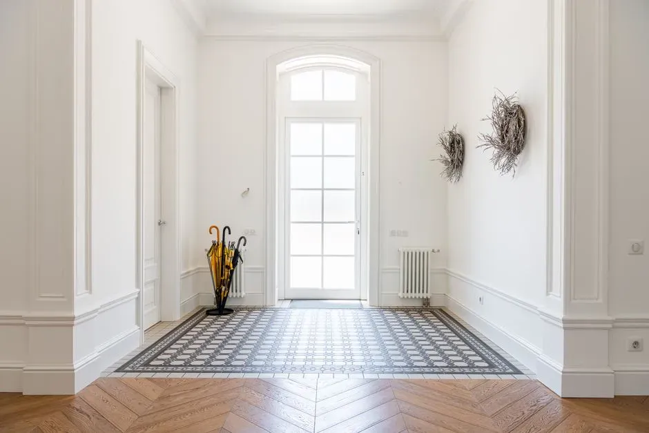
Plain white walls are losing ground to something softer. Stark white walls are giving way to warm off whites, including linen, antique cream, and barely there butter yellow, which read as neutral but add a softness that pure white lacks. This matters more than people expect, since a slightly warm white avoids the sterile, clinical look that bright white can create under certain lighting.
These warmer whites also tend to photograph and live better in rooms with limited natural light. They photograph warmer, which is crucial for spaces where lighting can make white walls look sterile or blue tinted. For hallways, bedrooms, and open plan living areas, a creamy off white gives a calm backdrop without feeling flat.
Earthy terracotta and clay
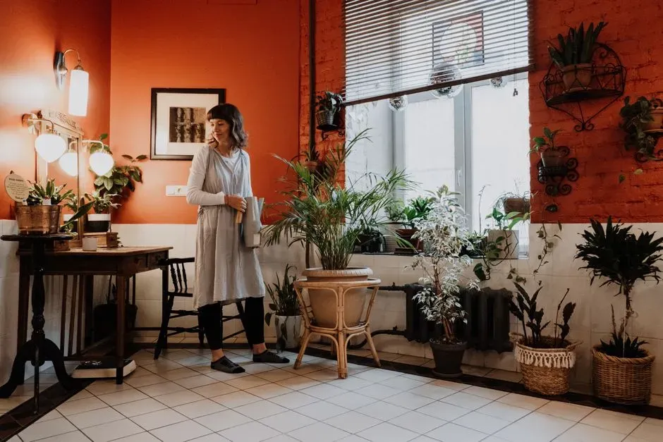
Warm earth tones have moved from accent walls into full room palettes. According to one design editor, the biggest shift for the year involves “returning to the earth in all aspects of the space,” with natural palettes drawn from warmer, muddier hues like terra cotta, olive green, and earthy grays. These colors feel grounded rather than dramatic, which is exactly the point for a relaxing room.
Desert inspired neutrals fall into this same family and carry a practical bonus. Desert inspired neutrals are flattering, and one designer noticed that a plaster wall color similar to Farrow and Ball’s Setting Plaster complemented a wide range of skin tones, enhancing the experience for everyone in the room. That’s a small but real detail worth considering for bathrooms and bedrooms where people spend time in front of a mirror.
Dusty mauve and soft pink
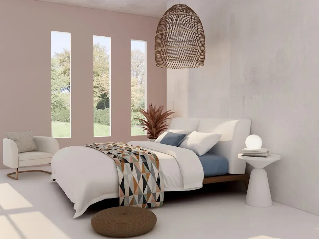
Pink has quietly reinvented itself as a calming, grown up color rather than a playful accent. In bedrooms specifically, one guide recommends soft, muted colors including soft mauve because bedrooms should promote relaxation and sleep, and soft, muted colors create a calming atmosphere. Dusty mauve in particular splits the difference between warm and cool, which makes it easy to pair with almost any wood tone.
Living rooms have embraced a similar muted pink through shades like Farrow and Ball’s Dead Salmon. A designer describes it as one that “feels unexpected yet still functions as a neutral,” with a soft blend of pink, brown, and earth tones that adds warmth without overwhelming a space. It’s a color that reads as sophisticated rather than sugary, especially against linen and stone textures.
Deep olive and forest greens
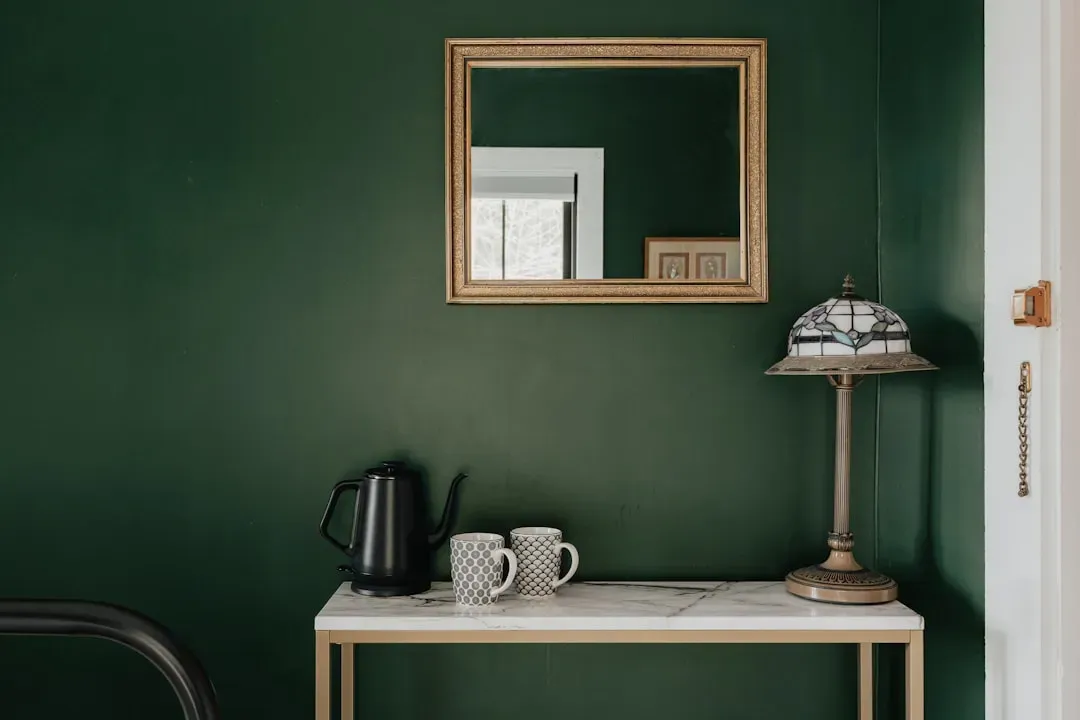
While pale sage suits bedrooms, deeper greens are taking over living rooms and studies. Designers point to deep greens like Dakota Woods Green by Benjamin Moore warming up reading rooms and grounding kitchen cabinetry. The darker value gives a room a sense of enclosure that feels cozy rather than cramped, especially in the evening.
Olive in particular has found new popularity as a grounding shade. One designer calls it her top living room pick, describing it as “rich olive green,” a grounding neutral that isn’t boring, interesting and soothing, cozy in winter and lively in spring and fall. Its versatility with other colors makes it a low risk way to bring depth into a room without losing the calm factor.
Warm taupe and sandy khaki
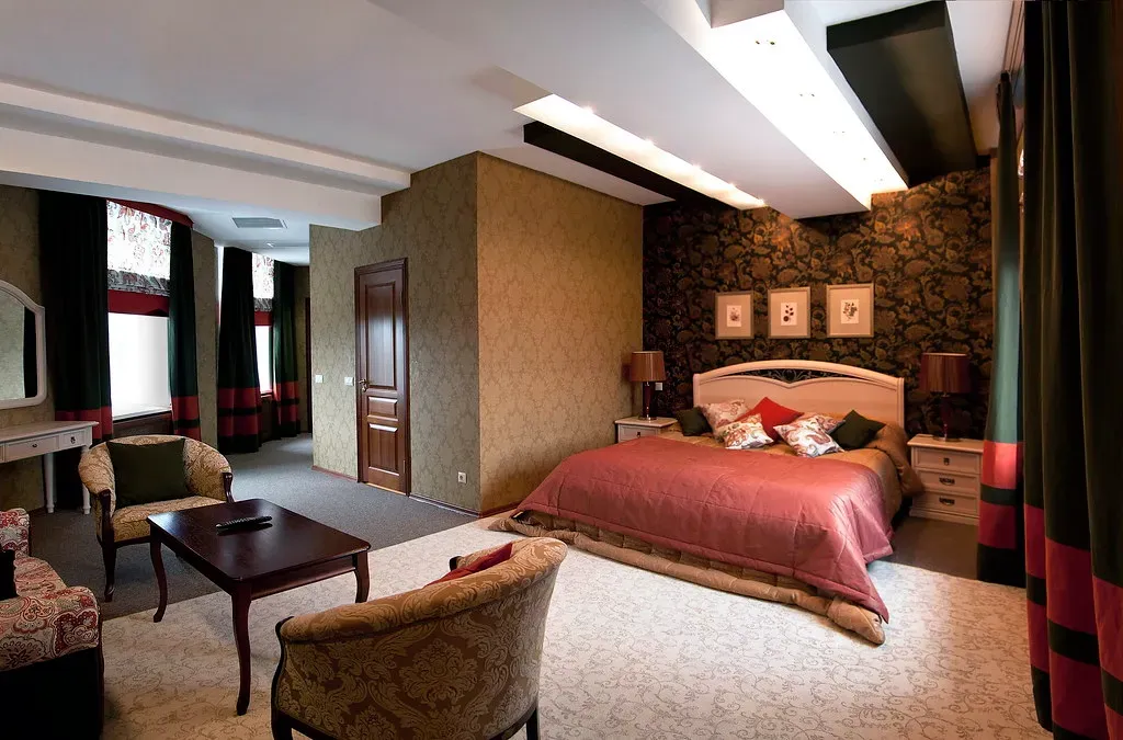
Sand toned neutrals have become the new default for people who want warmth without committing to a bold color. Sherwin Williams built its entire 2026 collection around this idea, choosing a khaki because neutrals are shifting to sandy shades, making the beautiful khaki the ideal choice for the brand’s Color of the Year. It works particularly well with natural materials, since stone and wood let the connection to the outdoors shine by featuring natural material in sculptural moments of décor.
Taupe follows a similar logic and is increasingly used as a whole house neutral rather than just a bedroom color. Medium depth browns and warm taupes are replacing the cool grays that defined the previous decade. The warmth in these tones keeps a room from feeling clinical, even in spaces with minimal furniture.
Color drenching in calming shades
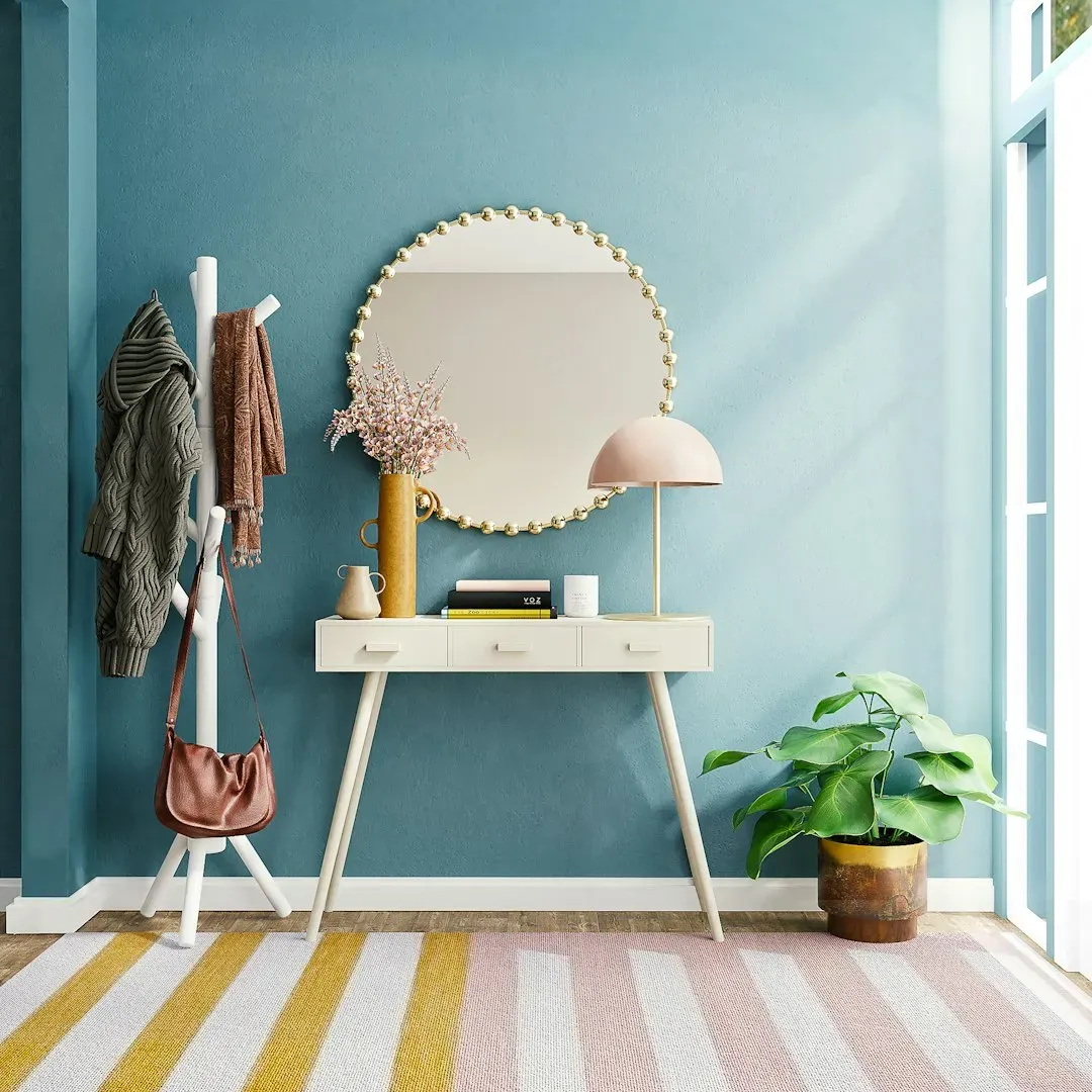
One of the more unexpected trends supporting relaxed interiors isn’t a single color but a technique. Color drenching involves painting walls, trim, and ceiling in the same shade, and the biggest application trend involves painting the baseboards, walls, crown molding, and even the ceiling in the same color, which makes ceilings feel higher because visual breaks are removed. Applied with a soft green or muted blue, the effect removes the visual clutter of contrasting trim and lets the eye settle rather than scan.
Getting the finish right matters as much as the color choice. Experts suggest using flat for the ceiling, eggshell or matte for the walls, and satin or semi gloss for the trim so the architecture still reads clearly even though everything shares one hue. It’s a subtle way to make a small or awkwardly shaped room feel calmer without adding new colors at all.
Choosing colors based on light and layout
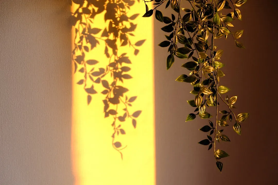
No color works the same way in every room, which is why lighting deserves as much attention as the paint chip itself. Design guidance is consistent on this point: lighting significantly affects how colors appear, and natural light tends to enhance soft greens and earth tones. A shade that feels serene in a south facing bedroom can look flat or muddy in a north facing hallway, so testing before committing matters more than trend charts do.
There’s also a psychological case for restraint that goes beyond aesthetics. Research cited in recent design coverage suggests performance on focus heavy tasks is often higher in neutral or white environments compared to high chroma ones, which can be overstimulating, since neutrals offer a kind of visual silence that grounds and stabilizes. That’s a useful reminder that doesn’t need many colors working at once. Often it just needs the right one, used with a little discipline.