Some rooms just feel right the moment you walk in. The furniture fits, the colors don’t fight each other, and there’s enough breathing room that nothing feels crammed or chaotic. You probably can’t name exactly why it works – you just know it does. That feeling isn’t luck, and it doesn’t require a professional designer or a generous budget.
Most well-designed rooms rely on a handful of consistent principles that decorators have used for decades. They’re not complicated, and they don’t demand a specific style or aesthetic. Decorating rules exist for a very important reason: to help us make decisions for our home that will turn it into a place that’s comfortable and pleasing to live in. These are the ones that hold up across every home, every style, and every budget.
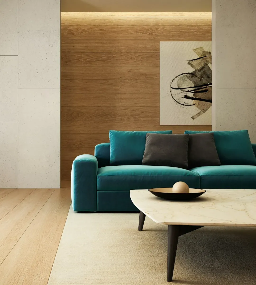
Get the 60-30-10 Color Rule Right
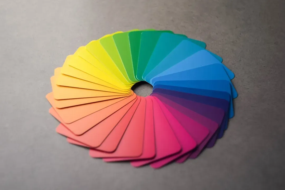
A simple rule of thumb to guide you through the process is the 60-30-10 color rule. This approach entails using a primary color for roughly sixty percent of the room, a secondary color for about thirty percent of it, and an accent color for the remaining ten percent. The dominant color typically lands on walls and large surfaces, the secondary on upholstery or curtains, and the accent on smaller details like throw pillows or artwork.
This ratio creates a balanced and harmonious color scheme that is easy on the eyes. It prevents any single hue from overwhelming the space, and it gives you a clear framework when you’re shopping. The colors you choose will set the tone for the ambiance of your entire home. While you may be tempted to use your favorite colors in a particular space, doing so may not create the atmosphere you’re striving for. It’s important to choose colors that will complement each other, suit the room’s function, and bring to life a cohesive look.
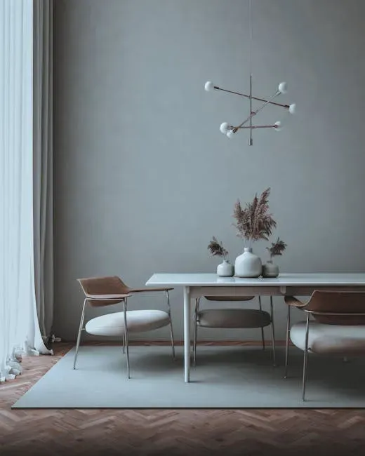
Always Group Things in Odd Numbers

The Rule of Three is a simple yet effective guideline that states that things arranged in odd numbers are more visually appealing to the human eye. Our brains are naturally drawn to odd numbers because they create a sense of balance and harmony while still challenging us mentally. This isn’t just a design trick – it’s rooted in how we visually process a scene.
Three is the smallest number that can be used to form a distinguishable pattern in our heads. Also, when you see an odd number of things, your eye is forced to move around more, which makes for a more interesting visual experience. The rule of three works for styling a coffee table, decorating a mantel, arranging furniture in a room, and so much more. Try it once and it becomes almost impossible to go back to pairs and fours.
Layer Your Lighting Instead of Relying on One Source
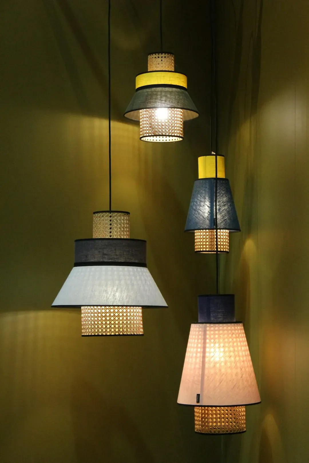
At its core, there are three types of lighting in interior design: ambient, task, and accent. Ambient lighting creates the overall atmosphere, task lighting provides clarity for work or daily rituals, and accent lighting draws the eye to what deserves attention – an architectural detail, a piece of art, or even the texture of a stone wall. Relying on a single overhead fixture is one of the most common mistakes people make.
Furnishing your home to look like it was decorated by an interior designer is as simple as learning how to layer your light sources. There are three types of lighting: ambient, task, and accent. Incorporating a combination of the three into your living spaces can help you achieve an inviting ambiance while maximizing the functionality of your home. Warm temperatures in the 2700 to 3000 Kelvin range work best for living and sleeping spaces, while neutral temperatures in the 3500 to 4000 Kelvin range suit kitchens and work areas.
Choose the Right Rug Size (Then Go Bigger)
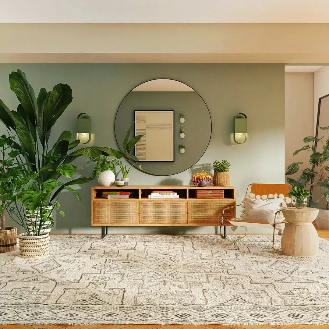
Few things can make a room look more awkward than a rug that’s too small for its surroundings. Interior design rules state that all furniture in a given space should be able to fit comfortably on the rug, or at the bare minimum, the front two legs of each piece should rest on the rug. This single decision does more to ground a room than almost any other furniture placement choice.
The biggest mistake you can make in choosing a rug size is opting for one that’s too small for the space. A common rule of thumb is to leave roughly eighteen to twenty-four inches of bare floor between the rug and the walls. This creates a frame that highlights your rug and makes the room feel more spacious. When in doubt, go up a size. The difference is always noticeable, and almost always worth it.
Match Scale to the Room
Oversized furniture can overwhelm a small room, while too-small pieces can look lost in a spacious layout. As a result, even the trendiest room will either feel cramped or evoke a sense of emptiness. To achieve a well-balanced setup, carefully consider the scale of your furnishings relative to your room’s dimensions. This principle applies to every element in the space, not just sofas and tables.
The proportions of a room and its furnishings are perhaps the most important consideration when decorating a space. You don’t want to end up with an overstuffed room full of furniture that’s too large for the space, or a room furnished with pieces that look like they belong in a dollhouse. To find a happy medium, pay attention to the size of your furnishings and how they relate to the overall size of the room. A practical trick: before purchasing furniture or decor, use painter’s tape to outline its dimensions on the floor or wall. This visual aid will help ensure the piece’s scale is appropriate for the space.
Mix Textures to Prevent Flatness
A mix of textures is key to preventing your space from feeling flat or one-note. Accent pillows, throw blankets, lampshades, and even plants can add an interesting textural element to a space without requiring a huge investment. For even more contrast, consider mixing furniture fabrics, such as a velvet couch with a leather chair, or incorporate accent furniture made from different materials, such as a wooden coffee table and glass side tables.
Texture is often the invisible ingredient in rooms that feel layered and considered. It doesn’t show up in paint swatches or floor plans – it’s something you feel when you look at a space. Balance is the common feature of most interior design ideas, keeping one part of a room from overshadowing others. It’s about using color, texture, and furniture placement to create a grounded and welcoming space. Mixing rough linen with smooth glass, or matte wood with a glossy ceramic, creates visual warmth without adding a single new color to the palette.
Give Negative Space Room to Breathe
Negative space is one of the interior design rules often overlooked in non-professional home decorating. Yet, it plays a crucial role in defining the look and feel of a room. If you neglect the negative space, there’s a big chance you’ll overstuff the layout. Allow some areas of your design to remain unoccupied: think of them as highlights and frames of the pieces you choose to include.
A good interior design rule of thumb is to ask yourself whether the element you’re considering contributes to the purpose and decorative needs of the space. If the answer is no, and you’re adding design flourishes just for personal taste, consider cutting them out and paring the scope back. Good use of negative space is crucial. Empty wall, bare shelf, clear corner – these aren’t problems waiting to be solved. They’re often exactly what the room needs.
Always Define a Focal Point
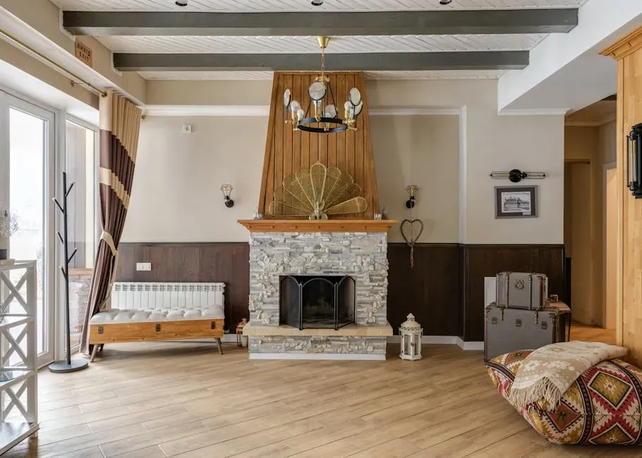
All expert designers agree that a focal point is crucial for tying a space together and determining what kinds of furniture, lighting, and decor are most appropriate. A room without a focal point feels directionless. Your eye doesn’t know where to land, and the whole arrangement ends up feeling restless. Your focal point doesn’t have to be a single item. Consider creating a captivating setup around a fireplace, for example. Also, use strategic lighting to further accentuate this arrangement, ensuring it catches the eye immediately.
In rooms without a natural focal point like a fireplace or a view, you can create one with an oversized piece of artwork, a bold piece of furniture, or a statement light fixture. The key is commitment. Once the focal point is established, everything else in the room should be arranged in relation to it, not competing with it. Home decorating principles should still work together to convey harmony, where elements complement each other. Otherwise, a room can feel disjointed and unsettling, as if every piece competes for attention. The best way to avoid that is to carefully select colors, materials, and furniture sharing a common style or aesthetic.
Prioritize Functionality Alongside Beauty
A cornerstone of interior decorating ensures that a space is as practical as it is aesthetically pleasing. Ignoring functionality can lead to a beautiful yet unserviceable room, undermining its overall comfort and usability. Focus on sourcing furniture and decor that support inhabitants’ daily activities. Moreover, consider the flow of movement and aim to facilitate easy navigation.
One way to accomplish this is to choose furniture and decor that serves both aesthetic and practical purposes. For example, a bench in your entryway that includes built-in storage or swivel chairs at your kitchen bar that can be used in an adjoining room. Great design reaches beyond making a room feel or look good. A well-designed room is also a well-functioning room. The two qualities aren’t in tension – the best spaces manage both at once, and it’s usually the functional choices that make them feel genuinely livable over time.
Keep the Arrangement Balanced, Not Necessarily Symmetrical
Balance is the common feature of most interior design ideas, keeping one part of a room from overshadowing others. It’s about using color, texture, and furniture placement to create a grounded and welcoming space. To achieve this, spread out the visual weight evenly across the room. Try playing with different layouts, like symmetrical, asymmetrical, or radial, to see which one yields the most visually pleasing result.
Symmetry is easy and formal – two matching lamps, two identical chairs facing each other. Asymmetrical balance is a little harder to pull off, but tends to feel more natural and lived-in. Design is about balance, but we have to balance both symmetry and asymmetry. Pairs of objects can feel formal and symmetry can even feel a bit stuffy at times. So, you can soften those pairs by adding a group of three. For example, if you have a pair of lamps on a console table in your foyer, add a group of three accessories by one of the lamps. That small adjustment is often all it takes to shift a room from stiff to warm.