Some houses are objectively gorgeous. The finishes are right, the furniture is well chosen, the square footage is generous. You walk in expecting to feel immediately at ease, and instead something quietly unsettles you. You can’t name it, but it’s there.
It’s rarely one obvious flaw. More often, it’s a collection of small decisions that don’t quite align – subtle imbalances in light, proportion, layout, or flow that create a quiet sense of discomfort. These are the details worth paying attention to.
1. Mismatched Bulb Temperatures Across Rooms
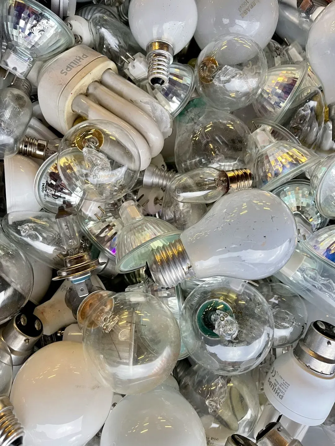
Designers notice light immediately, especially when bulbs don’t match from room to room. A house can be beautiful on paper and still feel “off” if one lamp is icy white, the overhead lights are yellow, and the kitchen is glowing blue. Good lighting reads intentional and calm. Bad lighting makes even expensive finishes feel harsh.
Combining different bulb temperatures in the same room creates visual discomfort. Warm light makes colors appear rich and amber, while cool light casts gray or blue tones. When both are present, the eye struggles to settle because the color story constantly shifts. Sticking to one temperature, preferably around 2700 Kelvin, and not exceeding 3000 Kelvin for most living spaces keeps things consistent.
2. A Rug That’s Too Small for the Room
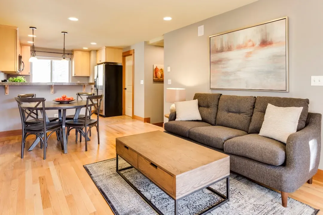
If a rug is too small, it doesn’t matter how gorgeous it is: designers will notice. A tiny rug floating under a coffee table tends to make an entire room feel cheaper and more cramped. Properly scaled rugs create grounding and proportion. It’s one of the fastest ways to tell whether a space was designed thoughtfully.
People often buy a rug which is too small for the room. The goal is for the rug to feel completely committed to the space, nearly filling it rather than being completely covered by the sofa or bed. A good rule of thumb: area rugs should be big enough so that at least the front legs of furniture can rest on them.
3. Curtains Hung Too Low or Too Narrow
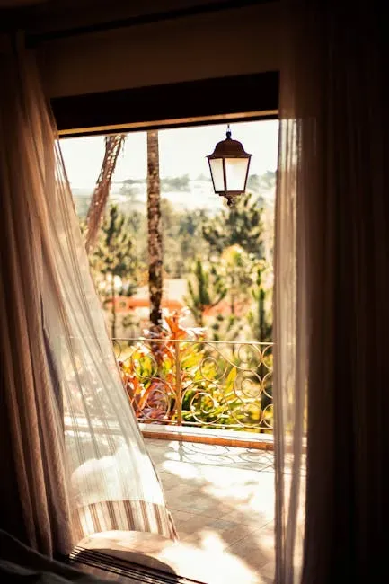
Curtains hung too low or too narrow instantly shrink a room visually. Designers notice whether drapery has proper height and fullness because it’s one of the most common “almost-right” mistakes – and one of the easiest ways to make a room feel elevated.
When curtain rods are mounted just above the window frame rather than close to the ceiling, the room loses a sense of height it could have had. It’s a detail most homeowners only register after someone points it out, but once seen, it’s impossible to unsee. Hanging fabric high and letting it fall all the way to the floor is one of the simplest upgrades a room can get.
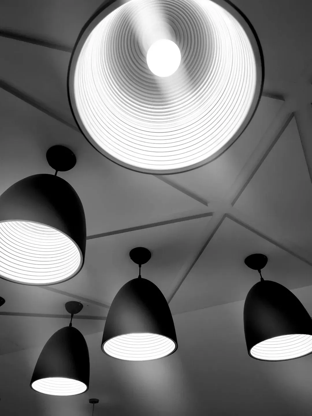
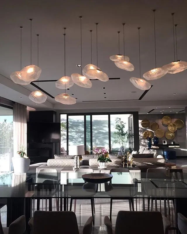
4. Relying on a Single Overhead Light Source
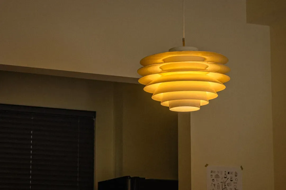
Lighting is one of the most important elements in a room, and somehow it is often the last one addressed. People usually invest in furniture, colors and textiles, then “wrap things up” with a single striking ceiling fixture, expecting it to carry the entire room. A central light fixture, however beautiful, cannot carry an entire space alone. Without layered lighting, the home remains flat and sometimes simply unpleasant to spend time in.
Lighting can make or break the feel of a room, yet it’s often an afterthought in design. Relying on a single overhead light is a common mistake that leaves a space feeling flat and uninviting. Instead, think in layers: combine overhead lighting with table lamps, floor lamps, and wall sconces to create depth and flexibility.
5. Furniture Pushed Against Every Wall
There is an almost instinctive tendency to push everything against the walls. Without noticing, the living room starts to look more like a waiting room than an inviting place where people actually want to sit. The mistake comes from the desire to “open” the space and leave as much empty floor as possible in the middle.
Sometimes a room looks large enough but resists comfortable furniture placement. Chairs feel too far apart, sofas don’t align with focal points, and tables end up slightly out of proportion. Even with expensive furniture, the space doesn’t feel settled. This often happens when the room’s proportions or focal points weren’t clearly defined during the design phase.
6. Artwork Hung Too High on the Wall
If you need to lift your head to see a picture, you probably hung it too high. Art should meet the eyes, not the ceiling. One common mistake is hanging art “high and beautiful,” which disconnects it completely from the room and the furniture around it. The center of the picture should be at eye level, roughly 5 feet from the floor, so it connects with the other elements.
Installing artwork at eye level, usually 57 to 60 inches from floor to the middle of the piece, is one of the most underused interior design concepts that can make rooms appear instantly more sophisticated. When art floats too high on a wall, it creates an awkward visual gap between the furniture below and the piece above, and the two halves of the room never feel like they belong together.
7. No Cohesive Color Flow Between Rooms
Treating each room as a separate project might sound like a good idea, but it can result in a disjointed look throughout your house. Lack of flow between spaces can make your home feel fragmented and chaotic instead of harmonious. To tie everything together, use a consistent color palette or repeating elements like materials, finishes, or design styles. This doesn’t mean every room needs to look identical – just connected.
Some homes feel as though each room was designed separately, without a clear connection to the rest. Styles, proportions, and materials shift from space to space. Even when each room looks good individually, the house as a whole can feel unsettled.
8. Fixtures That Are the Wrong Size for the Space
Lighting that is too large or too small for a space can disrupt the entire design. Oversized fixtures in small rooms overwhelm the space, while undersized lights appear weak and ineffective. Proportion plays a major role in how balanced the room feels.
Another frequent error is ignoring the effect of color temperature in fixture selection. Warm tones create a cozy, welcoming environment, while cooler tones suit workspaces and modern interiors. Choosing the wrong type can make a space feel harsh, clinical, or inconsistent with the rest of the home. A pendant light that’s slightly too small above a dining table sends a subtle signal that the space was never quite finished.
9. Recessed Lights Placed Directly Above the Dining Table
Placing recessed lighting directly above a dining table creates harsh downlighting that is unflattering to people and food alike, exaggerating shadows and flattening features. It’s one of those choices that looks fine on a lighting plan but feels wrong the moment you actually sit down to eat.
A pendant or chandelier hung about 30 to 36 inches above the table creates a warm, intimate pool of light that enhances the dining experience. The difference isn’t just aesthetic. It changes how long people want to linger at the table and how the whole room reads after dark.
10. Oversized Tiles That Flatten Smaller Spaces
Defaulting to large format tiles, which have become so common they no longer signal luxury, is a subtle but real design misstep. Oversized tiles can flatten a space and remove visual texture, especially in smaller rooms like bathrooms and kitchens. Unless used intentionally in very large spaces, they tend to work against the room.
Using identical tile on both floors and walls creates a “boxed-in” feeling that even the most expensive materials can’t overcome. Varying the tile format, direction, or finish between horizontal and vertical surfaces gives a room the kind of depth that reads as considered rather than copied from a showroom catalog.
11. Art That Only Matches the Sofa
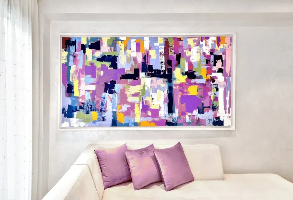
One of the most common interior design missteps is choosing art that simply matches a sofa or the surrounding décor. Art should stand on its own, introducing unexpected elements that bring life and contrast to a room.
Matching art to furniture limits flexibility and creativity, whereas selecting meaningful pieces allows them to outlast changing design choices and elevate the entire space. A room where every element was chosen to coordinate perfectly can start to feel more like a catalog page than a home. A painting that introduces one unexpected tone or subject matter quietly signals that someone actually lives there.
12. Too Much Negative Space or Too Little of It

A big tell: does the house panic in silence? If every surface is filled, every wall is busy, every corner has something in it, well-designed homes allow breathing room. They use negative space to make everything else feel more deliberate.
The reverse problem is equally common. A room stripped too bare can read as unfinished, even cold. The goal isn’t minimalism by default but rather finding the right ratio between negative and positive space given your room and aesthetic, which alone can improve the chaos of a room. Getting that balance right is harder than it sounds, which is why so many rooms land just slightly to one side of it.
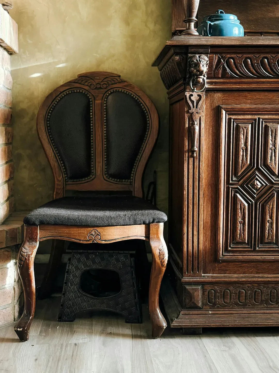
13. Hardware and Touchpoints That Don’t Match the Room’s Quality
Designers notice what hands touch: door handles, faucet handles, cabinet pulls, switches. Even if the home looks pretty, flimsy touchpoints make it feel less substantial. Quality hardware doesn’t have to be flashy – it just has to feel right.
Low-quality materials like thin veneers, plastic finishes, or low-quality textiles wear out quickly and often don’t age well. They can make an entire room feel less sophisticated, even if the overall design is strong. The disconnect is felt most acutely in places you interact with daily. A beautiful kitchen with hollow-feeling cabinet pulls is a subtle but persistent source of that hard-to-place unease.
14. Uncontrolled Natural Light With No Way to Manage It

When window placement makes it hard to use window treatments and control brightness, the results can make a space unbearable to be in, particularly in hotter months of the year. The result is a space that nobody will use for most parts of the day, even if it’s well designed.
Light has a powerful effect on how a space feels, and when it’s poorly balanced, the discomfort is immediate even if it’s hard to explain. Some rooms are flooded with brightness near the windows but fall into shadow just a few feet away. Others rely too heavily on overhead lighting, creating glare rather than warmth. Natural light is one of a home’s greatest assets, but without a thoughtful plan for managing it, it can quietly undermine a room that otherwise gets everything right.
Most of these details aren’t expensive to fix. A few are as simple as moving a curtain rod six inches higher or swapping out a bulb. What they share is that they operate just below the level of conscious notice, creating a feeling that something isn’t quite right without ever revealing what. Recognizing them is more than half the work.